The Pinnacle of Apple's Smartphone Engineering: A Deep Dive into the iPhone Pro Max
(0) - (0)
iPhone - 2025.06.16
#iphone
iPhone
View
View AMP
The Pinnacle of Apple's Smartphone Engineering: A Deep Dive into the iPhone Pro Max
The iPhone Pro Max consistently represents the zenith of Apple's smartphone offerings, combining cutting-edge technology, a premium design, and an unparalleled ecosystem. Geared towards power users, content creators, and anyone who demands the absolute best from their mobile device, the Pro Max series has evolved into a formidable competitor in the high-end smartphone market. This review delves into the key aspects of the latest iPhone Pro Max model, examining its strengths and weaknesses to provide a comprehensive overview.
Design and Display: A Visual and Tactile Masterpiece
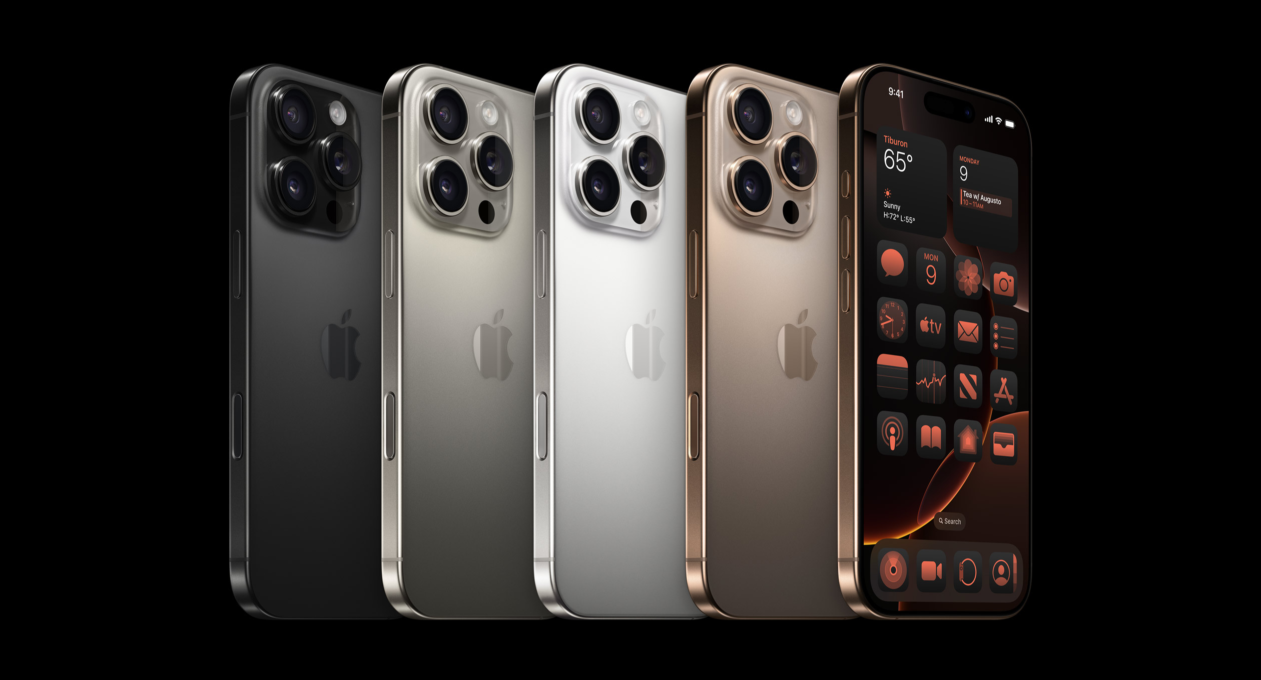
From the moment you hold the iPhone Pro Max, its premium build quality is undeniable. The device typically features a sophisticated blend of aerospace-grade aluminum or surgical-grade stainless steel frames, sandwiched between durable Ceramic Shield front covers and textured matte glass backs. This not only exudes a sense of luxury but also contributes to its robust feel. While the size can be substantial, especially for those with smaller hands, the weight distribution is generally well-balanced. The squared-off edges, a design choice introduced a few generations ago, provide a secure grip, albeit some may find them less ergonomic than rounded alternatives over extended periods.
The Super Retina XDR display is undoubtedly one of the iPhone Pro Max's crowning jewels. Utilizing OLED technology, it delivers breathtaking visuals with incredibly vibrant colors, true blacks, and exceptional contrast ratios. Peak brightness levels are astounding, making content legible even under direct sunlight, a crucial feature for outdoor use. ProMotion technology, offering adaptive refresh rates up to 120Hz, ensures buttery-smooth scrolling, incredibly fluid animations, and a more responsive overall user experience. This high refresh rate is particularly beneficial for gaming and consuming fast-paced content, significantly enhancing the visual fluidity. While most users will be delighted by the display's quality, some might find the notch (or Dynamic Island, depending on the generation) to still be an aesthetic intrusion, even if its functionality has evolved.
Performance: Unmatched Powerhouse
Under the hood, the iPhone Pro Max houses Apple's latest A-series Bionic chip, consistently setting benchmarks for smartphone performance. This chip, coupled with optimized iOS software, delivers an incredibly fluid and responsive user experience. From launching demanding applications and multitasking seamlessly to rendering complex graphics in games, the Pro Max handles everything with effortless grace. Video editing, graphic design, and even some light professional work can be performed directly on the device without significant slowdowns. This raw processing power also drives advanced computational photography features and machine learning capabilities, further enhancing the device's versatility. For the vast majority of users, this level of performance is overkill, but it ensures future-proofing and a consistently smooth experience for years to come.
Camera System: Professional-Grade Photography in Your Pocket
The camera system on the iPhone Pro Max is arguably its most significant selling point for many. Apple consistently pushes the boundaries of smartphone photography, and the Pro Max model is equipped with a versatile array of lenses – typically a wide, ultra-wide, and telephoto lens. Each generation brings improvements in sensor size, aperture, and computational photography algorithms.
Low-light performance is often a standout feature, with Night mode producing remarkably bright and detailed images even in challenging conditions. Photographic Styles, ProRAW, and ProRes video recording (on newer models) provide professional-level control and flexibility for content creators. The cinematic mode, with its impressive depth-of-field effects for video, allows users to capture stunning, professional-looking footage. While the sheer quality of the images and videos is undeniable, some users might find Apple's color science to lean slightly towards a more natural and less saturated look compared to some Android competitors, which can be a matter of personal preference. The zoom capabilities, while excellent, may not always match the extreme optical zoom ranges offered by some rivals.
Battery Life: Endurance for the Long Haul
One of the most praised aspects of the iPhone Pro Max series is its exceptional battery life. Thanks to its larger physical size, it accommodates a significantly larger battery compared to its smaller siblings. This translates into genuinely all-day, and often multi-day, usage for most users on a single charge. Heavy usage involving gaming, video streaming, and extensive camera work will naturally drain the battery faster, but it still outperforms many competitors. This superior endurance is a major convenience for travelers, busy professionals, and anyone who doesn't want to constantly worry about finding a charger. Fast charging capabilities are present, though Apple's included charger is often not the fastest available, requiring an additional purchase for optimal speeds. Wireless charging and MagSafe also add to the charging convenience.
Software and Ecosystem: Seamless Integration
iOS, Apple's mobile operating system, is renowned for its intuitive interface, robust security features, and seamless integration with Apple's vast ecosystem of devices and services. The Pro Max benefits from all the latest iOS updates, ensuring access to new features, performance enhancements, and security patches. The App Store offers an unparalleled selection of high-quality applications, and the tight integration with iCloud, Apple Music, Apple Watch, AirPods, and Mac devices creates a cohesive and incredibly user-friendly experience. Handoff, AirDrop, and Universal Clipboard are just a few examples of features that exemplify this seamless interoperability. While iOS offers a highly curated and polished experience, some users accustomed to the open-source nature and deeper customization options of Android might find it somewhat restrictive.
Downsides and Considerations
Despite its numerous strengths, the iPhone Pro Max is not without its drawbacks.
1. Price: The most significant barrier for many is the hefty price tag. The Pro Max models are consistently among the most expensive smartphones on the market, putting them out of reach for a considerable portion of consumers.
2. Size and Weight: While some appreciate the larger display, the sheer size and weight of the Pro Max can be cumbersome for extended one-handed use or fitting into smaller pockets.
3. Port Limitations: Apple's continued reliance on the Lightning port (though USB-C has appeared on the latest models) has been a point of contention for some, limiting universal compatibility with other devices that predominantly use USB-C. Even with USB-C, Apple's implementation might not always offer the fastest data transfer speeds found on some competing devices.
4. Limited Customization: While iOS is polished, it offers less in the way of deep customization options compared to Android, which might frustrate users who prefer to personalize every aspect of their device.
5. Incremental Updates: For existing Pro Max users, the annual updates, while bringing significant improvements, might feel incremental rather than revolutionary, especially if upgrading from a relatively recent model.
Conclusion
The iPhone Pro Max is an undeniably impressive piece of technology, delivering a premium experience across the board. Its stunning display, unmatched performance, professional-grade camera system, and exceptional battery life make it a compelling choice for those who demand the best. The seamless integration with Apple's ecosystem further enhances its appeal, creating a cohesive and intuitive user experience.
However, its high price, substantial size, and the inherent limitations of the iOS ecosystem (for some users) are important considerations. For power users, photographers, videographers, and anyone who prioritizes a top-tier mobile experience and is willing to invest accordingly, the iPhone Pro Max stands as a testament to Apple's engineering prowess and remains a leading contender in the premium smartphone segment. For those on a tighter budget or who prefer a more open and customizable operating system, exploring alternatives might be a more suitable option.
The Pinnacle of Apple's Smartphone Engineering: A Deep Dive into the iPhone Pro Max
The iPhone Pro Max consistently represents the zenith of Apple's smartphone offerings, combining cutting-edge technology, a premium design, and an unparalleled ecosystem. Geared towards power users, content creators, and anyone who demands the absolute best from their mobile device, the Pro Max series has evolved into a formidable competitor in the high-end smartphone market. This review delves into the key aspects of the latest iPhone Pro Max model, examining its strengths and weaknesses to provide a comprehensive overview.
Design and Display: A Visual and Tactile Masterpiece
From the moment you hold the iPhone Pro Max, its premium build quality is undeniable. The device typically features a sophisticated blend of aerospace-grade aluminum or surgical-grade stainless steel frames, sandwiched between durable Ceramic Shield front covers and textured matte glass backs. This not only exudes a sense of luxury but also contributes to its robust feel. While the size can be substantial, especially for those with smaller hands, the weight distribution is generally well-balanced. The squared-off edges, a design choice introduced a few generations ago, provide a secure grip, albeit some may find them less ergonomic than rounded alternatives over extended periods.
The Super Retina XDR display is undoubtedly one of the iPhone Pro Max's crowning jewels. Utilizing OLED technology, it delivers breathtaking visuals with incredibly vibrant colors, true blacks, and exceptional contrast ratios. Peak brightness levels are astounding, making content legible even under direct sunlight, a crucial feature for outdoor use. ProMotion technology, offering adaptive refresh rates up to 120Hz, ensures buttery-smooth scrolling, incredibly fluid animations, and a more responsive overall user experience. This high refresh rate is particularly beneficial for gaming and consuming fast-paced content, significantly enhancing the visual fluidity. While most users will be delighted by the display's quality, some might find the notch (or Dynamic Island, depending on the generation) to still be an aesthetic intrusion, even if its functionality has evolved.
Performance: Unmatched Powerhouse
Under the hood, the iPhone Pro Max houses Apple's latest A-series Bionic chip, consistently setting benchmarks for smartphone performance. This chip, coupled with optimized iOS software, delivers an incredibly fluid and responsive user experience. From launching demanding applications and multitasking seamlessly to rendering complex graphics in games, the Pro Max handles everything with effortless grace. Video editing, graphic design, and even some light professional work can be performed directly on the device without significant slowdowns. This raw processing power also drives advanced computational photography features and machine learning capabilities, further enhancing the device's versatility. For the vast majority of users, this level of performance is overkill, but it ensures future-proofing and a consistently smooth experience for years to come.
Camera System: Professional-Grade Photography in Your Pocket
The camera system on the iPhone Pro Max is arguably its most significant selling point for many. Apple consistently pushes the boundaries of smartphone photography, and the Pro Max model is equipped with a versatile array of lenses – typically a wide, ultra-wide, and telephoto lens. Each generation brings improvements in sensor size, aperture, and computational photography algorithms.
Low-light performance is often a standout feature, with Night mode producing remarkably bright and detailed images even in challenging conditions. Photographic Styles, ProRAW, and ProRes video recording (on newer models) provide professional-level control and flexibility for content creators. The cinematic mode, with its impressive depth-of-field effects for video, allows users to capture stunning, professional-looking footage. While the sheer quality of the images and videos is undeniable, some users might find Apple's color science to lean slightly towards a more natural and less saturated look compared to some Android competitors, which can be a matter of personal preference. The zoom capabilities, while excellent, may not always match the extreme optical zoom ranges offered by some rivals.
Battery Life: Endurance for the Long Haul
One of the most praised aspects of the iPhone Pro Max series is its exceptional battery life. Thanks to its larger physical size, it accommodates a significantly larger battery compared to its smaller siblings. This translates into genuinely all-day, and often multi-day, usage for most users on a single charge. Heavy usage involving gaming, video streaming, and extensive camera work will naturally drain the battery faster, but it still outperforms many competitors. This superior endurance is a major convenience for travelers, busy professionals, and anyone who doesn't want to constantly worry about finding a charger. Fast charging capabilities are present, though Apple's included charger is often not the fastest available, requiring an additional purchase for optimal speeds. Wireless charging and MagSafe also add to the charging convenience.
Software and Ecosystem: Seamless Integration
iOS, Apple's mobile operating system, is renowned for its intuitive interface, robust security features, and seamless integration with Apple's vast ecosystem of devices and services. The Pro Max benefits from all the latest iOS updates, ensuring access to new features, performance enhancements, and security patches. The App Store offers an unparalleled selection of high-quality applications, and the tight integration with iCloud, Apple Music, Apple Watch, AirPods, and Mac devices creates a cohesive and incredibly user-friendly experience. Handoff, AirDrop, and Universal Clipboard are just a few examples of features that exemplify this seamless interoperability. While iOS offers a highly curated and polished experience, some users accustomed to the open-source nature and deeper customization options of Android might find it somewhat restrictive.
Downsides and Considerations
Despite its numerous strengths, the iPhone Pro Max is not without its drawbacks.
1. Price: The most significant barrier for many is the hefty price tag. The Pro Max models are consistently among the most expensive smartphones on the market, putting them out of reach for a considerable portion of consumers.
2. Size and Weight: While some appreciate the larger display, the sheer size and weight of the Pro Max can be cumbersome for extended one-handed use or fitting into smaller pockets.
3. Port Limitations: Apple's continued reliance on the Lightning port (though USB-C has appeared on the latest models) has been a point of contention for some, limiting universal compatibility with other devices that predominantly use USB-C. Even with USB-C, Apple's implementation might not always offer the fastest data transfer speeds found on some competing devices.
4. Limited Customization: While iOS is polished, it offers less in the way of deep customization options compared to Android, which might frustrate users who prefer to personalize every aspect of their device.
5. Incremental Updates: For existing Pro Max users, the annual updates, while bringing significant improvements, might feel incremental rather than revolutionary, especially if upgrading from a relatively recent model.
Conclusion
The iPhone Pro Max is an undeniably impressive piece of technology, delivering a premium experience across the board. Its stunning display, unmatched performance, professional-grade camera system, and exceptional battery life make it a compelling choice for those who demand the best. The seamless integration with Apple's ecosystem further enhances its appeal, creating a cohesive and intuitive user experience.
However, its high price, substantial size, and the inherent limitations of the iOS ecosystem (for some users) are important considerations. For power users, photographers, videographers, and anyone who prioritizes a top-tier mobile experience and is willing to invest accordingly, the iPhone Pro Max stands as a testament to Apple's engineering prowess and remains a leading contender in the premium smartphone segment. For those on a tighter budget or who prefer a more open and customizable operating system, exploring alternatives might be a more suitable option.
View
(
0) liked
(
0) commented
After you login, you can see the comments and like the post. Login
APPLE WATCH SERIES 4 REVIEW: THE BEST GETS BETTER
(0) - (0)
Apple watch | 애플워치 - 2018.09.20
#applewatch4
#applewatch3
#2018applewatch
#apple
Apple watch | 애플워치
View
View AMP
The greatest Apple product comeback story of the past few years has, without a doubt, been the Apple Watch. Launched with great fanfare four years ago, the initial version tried to do way too much with way too little, and it had confusing software to boot. Worst of all, it was unclear what the original Apple Watch was even for. No single thing stood out.
Then Apple did what Apple often does: iterated, refined, and fixed. But as much as there were software and hardware improvements to the Series 2 and Series 3, the most important refinements were to the Apple Watch’s purpose. It gained clarity. It was for fitness and notifications. Eventually, when it was ready, Apple added better connectivity.
Now, with the Series 4, Apple is iterating again. And, importantly, it’s learned how to iterate the product’s hardware and its purpose at the same time. The Series 4 has finally achieved something like the original goal of the Apple Watch. It’s not quite a do-anything computer on your wrist, but it can be different things to different people now.
With apologies to the new iPhones, the Apple Watch Series 4 was the most impressive thing Apple announced last week. After using it for the past week or so, I think it lives up to the hype.
8.5VERGE SCORE
GOOD STUFF
- Great battery life
- Huge, beautiful screen
- Health-tracking features, not just fitness
BAD STUFF
- Siri is still unreliable
- No always-on screen option
- Complication options can be confusing
Buy for $399.00 from Apple
For the first time since the original Apple Watch, the hardware has been fully redesigned, with a new body and new sizes. But it’s not a major overhaul. These still look like the Apple Watches you’re used to: they have the same rounded-corner lozenge shape, the same glass that curves around to match the body, and the same digital crown and single-button layout.
Before we get too far, we should talk pricing. This Watch is not especially cheap. The smallest, least expensive model comes with GPS and Wi-Fi and costs $399. But if you start piling on the upgrades, you can quickly jack up the price to something that feels exorbitant, especially if you’re upgrading from a Series 2 or Series 3. It’s $29 more for the larger size, $100 for LTE compatibility (plus $10 per month or so from your carrier), and the stainless steel models are $200 more (and only come with LTE). Add in Apple Care, and you can end up spending a lot — though it’s nothing like the wild “Edition” prices of yore. (Don’t even get me started on the Hermès model.)
THE LARGER SIZES DON’T FEEL THAT MUCH BIGGER THAN THE OLDER MODELS
The two new sizes are 40mm and 44mm, but they really don’t feel that much bigger on your wrist than the old sizes. I was using the 42mm Series 3 and the 44mm size is only subtly bigger, but it’s also subtly thinner. To me, it feels about the same, but I think the trade-off of size for thinness is worth it. I suspect the same will be true for people who prefer the smaller size, but my recommendation is to go to a store and try one on before buying.
I’m really happy — and impressed — that Apple managed to make existing Watch bands fully compatible with the new sizes. Even my old third-party bands fit seamlessly into the new Watch body.
Things look different when the screen turns on. The screen on the Series 4 is just incredibly good. Apple says it’s 30 percent bigger, which is one of those specs that’s easy to just sort of pass over when you read it. But 30 percent is a lot, and you absolutely notice it right away.
It’s still OLED so the blacks are truly black and blend into the watchface glass. But if you pick a full-screen watchface, you’ll see that the screen also goes closer to the edges of the Watch than before, including the rounded corners.
The overall effect makes the square display on my Series 3 look dumpy and cramped by comparison — even though, until last week, it was arguably the best smartwatch screen on the market. As John Gruber writes, “The Series 4 displays take up so much more of the face of the watches that the new 40mm watch’s display is larger than the display on the old 42mm models — the new small watch has a larger display than the old large watch.”
:no_upscale()/cdn.vox-cdn.com/uploads/chorus_asset/file/13111171/vpavic_180917_2949_0203.jpg)
:no_upscale()/cdn.vox-cdn.com/uploads/chorus_asset/file/13111151/vpavic_180917_2949_0210.jpg)
:no_upscale()/cdn.vox-cdn.com/uploads/chorus_asset/file/13111173/vpavic_180917_2949_0235.jpg)
Beyond the size and the screen, there are a few other subtle exterior differences to note about the hardware. The rear of the Watch is now ceramic instead of metal to allow for a better wireless signal. If you spring for the LTE model, the garish red dot on the digital crown has been replaced with a much more subtle red ring.
The microphone has been moved between the two buttons so that it’s further away from the speaker to help reduce echo in calls. The speaker has been boosted to provide more volume. It really is way louder, and I haven’t heard any distortion during phone calls.
Last year’s Apple Watch had some issues with LTE at launch, though Apple fixed it up fairly quickly. This year, I haven’t had any major problems with LTE. In fact, several people I called with the Watch simply didn’t believe I wasn’t on a phone. It sounds good, and the louder speaker means you can hear it without holding the thing next to your ear.
But it does take the Watch a minute (sometimes two) to switch on LTE and get connected. That’s not radically worse than what happens when you pull your phone out of airplane mode, but on the Watch, it’s always a little less clear what’s happening and why when data is not coming in.
On the inside, there’s a faster S4 processor, a W3 chip (which is just Apple’s W2 chip with Bluetooth 5.0 support), and an accelerometer and gyroscope that are able to take samples of your movements more often (which is how Apple was able to add the new fall detection feature). Apple’s also tied haptics to the digital crown, so when you spin it, you feel little ticks that precisely correlate to what’s happening on the screen. It’s completely unnecessary but pretty neat.
BATTERY LIFE HAS BEEN STUPENDOUS
Last but certainly not least: the battery size is about the same. Battery life on the Series 4 is as good or better than on the Series 3 Watch. Apple claims 18 hours of regular use or six hours of outdoor workouts. I haven’t done a six-hour outdoor workout (and I don’t plan to), but my testing shows the battery life far exceeds Apple’s own claims.
I took the Watch off the charger on Saturday morning and wandered around Oakland for four hours while disconnected from my phone. I used LTE for maps, a couple calls, and GPS for tracking my outdoor walk “workout.” I was still at 50 percent at the end of that day, and I didn’t get below 20 percent by the end of my lazy Sunday (which also involved an hour or so of GPS tracking and some LTE data).
The battery life is so good that I wish Apple gave me an option for an always-on ambient screen, maybe by turning off some radios. Alas, you still have to turn your wrist to see the time.
:no_upscale()/cdn.vox-cdn.com/uploads/chorus_asset/file/13111157/vpavic_180917_2949_0076.jpg)
watchOS 5 is kind of a grab bag of new features, which sounds dismissive, but I don’t mean it to be. It’s a good sign that watchOS is ready to be laden with features instead of rethought from the ground up, as it was in years past. There’s support for podcasts, Walkie Talkie mode, slightly improved (and grouped!) notifications, and a bunch of fitness and health options.
:no_upscale()/cdn.vox-cdn.com/uploads/chorus_asset/file/13112701/IMG_0030.png)
:no_upscale()/cdn.vox-cdn.com/uploads/chorus_asset/file/13112703/IMG_0031.png)
But the thing people will probably pay the most attention to are the new watchfaces that are available on the Series 4 Watches. They’re designed to show off the new rounded-corner screen. Some are just sort of flashy animations, while others are chock-full of new complications in phantasmagoric colors.
Of the new watchfaces, I am most fond of the animated ones. Apple says that the fire, water, and vapor animations were all created with practical effects. As in: literal fire, vapor, and water were filmed with high-speed cameras as they flowed on custom-welded rigs. They look great; the animations naturally flow right up to the rounded corners.
The watchface that you’ll probably see the most in ads is called “infograph.” It takes the bigger screen of the Series 4 and fills it up with as many as eight complications. There’s a “modular” version as well that shows the digital time and six complications. Like many parts of watchOS 5, they use new, more rounded fonts, too.
The infograph watchface is polarizing. I don’t like it at all, though I wouldn’t go so far as to call it a “design crime.” There are just too many colors doing too many different kinds of work splashed all over the screen in a garish and show-offy way. Too many of Apple’s watchface options are like that. Call me boring, but I prefer a Watch look that’s a little more staid. It makes me a little sad that Apple still doesn’t allow third-party watchfaces.
Even if you like the new watchfaces, you probably won’t like what happens when you try to select a new complication. There are now “old”- and “new”-style complications, which are completely different and incompatible. The newer watchfaces need the new complications, so third-party developers will have to update their apps (and so will Apple). You can’t add the Home app to the new watchfaces, only the old ones. The most annoying part is that there’s no way to know what complications are available on any given watchface without scrolling through and looking for the one you want.
:no_upscale()/cdn.vox-cdn.com/uploads/chorus_asset/file/13111167/vpavic_180917_2949_0025.jpg)
On the fitness front, the best new feature is automatic workout detection, which can tell if you’ve started or stopped a workout and ask you if that’s the case and if you want to log it. There are now options for yoga, hiking, setting a target pace, and tracking your pace. You can also see your cadence as you run and challenge somebody to a week-long exercise competition. (I didn’t extensively test these features; I’m still at the “fill your damn rings” stage of my exercise goals.)
Maybe the most interesting change, though, is how Apple is more clearly separating out health features from the fitness stuff. There are a few new features in watchOS 5 and the Series 4 that are designed to help you detect health problems, not just encourage you to close those activity rings or run a marathon.
That’s interesting because it more explicitly positions the Apple Watch as a device that can help detect health problems, making it something that people who can’t exercise that much might be more interested in. Apple, as always, is very careful to not cross the line into making actual health claims about its new features. It’s careful to say that the Watch can detect things like irregular heartbeats, not that it will.
THERE’S A BIG DIFFERENCE BETWEEN “TRACKING YOUR FITNESS” AND “MONITORING YOUR HEALTH”
watchOS 5 is able to detect low heart rate now, in addition to high heart rate. Later this year, Apple will add detection for irregular rhythms and provide notifications for them. The big new feature on the Series 4 is that it can take an electrocardiogram (EKG) using electrodes built into the back of the Watch and the digital crown. It can then send a PDF of your results to your doctor. I wasn’t able to test that as it is coming later this year. Both irregular heartbeat detection and the EKG features have been granted “de novo” classification by the FDA, and that distinction is important, as Angela Chen explains:
It’s important to understand that the FDA has “cleared” both apps, but that’s not the same as “approving” them. There are usually three ways to get the FDA involved in a new project, according to Jon Speer, co-founder of Greenlight Guru, a company that makes quality management software for medical device companies. The most advanced is FDA approval, which is done only for Class III products, or technologies that might have higher risk but also a higher benefit. (Think: implantable pacemakers.) Approval is the gold standard, and companies need to do a lot of testing to receive this designation.
The Apple Watch is in Class II. For Class II and Class I, the FDA doesn’t give “approval,” it just gives clearance.
Another new feature exclusive to the Series 4 is hard fall detection, thanks to a new 800Hz accelerometer and gyroscope that can that can measure up to 32 G-forces. The Watch should be able to tell if you’ve had a spill and ask if you’d like to call emergency services. If you don’t move for a full minute after falling, it can do that automatically and also send a message to your emergency contact. Apple is turning it on automatically for users who tell the Watch they’re over age 65, and it’s making it an option for younger users as well.
I’ve tried to trigger it without hurting myself and I haven’t been able to, which I suppose is a point in the Watch’s favor. (My tests were far from scientific; I was just hurling myself at the couch.) Apple says that to build its fall detection algorithms, it used data from a study involving 2,500 participants over several years, and it also worked with assisted living facilities and movement disorder clinics.
So throwing yourself into bed after a long day shouldn’t trigger it, but a fall from a ladder or tripping over a curb and flailing your arms as you hit the ground might. Again, Apple’s health claims are not that the Watch will detect these falls, but simply that it could.
:no_upscale()/cdn.vox-cdn.com/uploads/chorus_asset/file/13111175/vpavic_180917_2949_0180.jpg)
A lot of people were really excited about Walkie Talkie mode, but after testing it, I don’t think it’s especially compelling. Unlike those classic Nextel Push-to-Talk phones, Walkie Talkie mode on the Apple Watch is essentially just a FaceTime Audio call with a button you press to talk and little beeps and visual indicators to tell you if it’s your turn.
:no_upscale()/cdn.vox-cdn.com/uploads/chorus_asset/file/13112603/IMG_0035.png)
When you send the first message, you have to wait for a connection to be made, and then it’s just tapping the screen and talking. The connection stays active until a few minutes after the last person finishes speaking. It’s neat, but it doesn’t feel as instant as a true PTT system. I also had connectivity problems with it, but that may have just been OS launch-day overloading.
That said, it’s silly fun to push the big yellow button with your nose when it’s your turn to talk. I strongly recommended it. (If it becomes a thing, I want to make sure I get full credit for coining the term “nose calls.”)
Siri on watchOS 5 is still Siri. There’s a new feature that lets you simply lift your wrist and start taking instead of pushing a button or saying “Hey Siri,” and it works really well. The Siri shortcuts you set up on your iPhone should also work from your Watch, too. Siri still feels super unreliable, though.
Siri gets especially fussy when you have a spotty connection. Too often, when I wanted to ask a question, I’d be met with a “hang on…” message, followed by a “I’ll tap you when I’m ready” message, followed by an interminable wait during which I’d forget whatever it was I needed Siri for.
One last little watchOS 5 thing I must mention: you can open links to webpages now, too, which is kind of fun. Articles you click on get put into readability mode, so you don’t have to worry too much about ads or bad layouts on your Watch. Hooray for the web!
:no_upscale()/cdn.vox-cdn.com/uploads/chorus_asset/file/13111159/vpavic_180917_2949_0162.jpg)
This year’s Apple Watch is incredibly good. If you use it just for notifications and step counting, it’s probably overkill, but it’s able to handle more advanced features better than any other smartwatch I’ve tested. Mapping, music, workouts, calls, texting, podcasts… most of the stuff I could imagine wanting from a smartwatch works better than ever before. The only real bummer is that I still don’t feel like I can trust Siri to do everything I’d like reliably, and that’s more of an intermittent hassle than a real killer.
If you’re looking at this Watch with an eye toward the health features, I have to admit that they’re difficult to test: the new features could be very compelling to a lot of people. Passive monitoring for heart problems and falls could literally be lifesavers, but they aren’t all available yet, and we’d need to see third-party lab testing to really make a call there.
THE APPLE WATCH HAS EARNED ITS PLACE AS THE BEST-SELLING WATCH
For people who are looking to upgrade an existing Apple Watch, that’s a harder question to answer than usual. Spending four to six hundred bucks for a bigger screen is a luxury I wouldn’t casually recommend to anybody, even though the screen is wonderful. Many of watchOS 5’s best features will work fine on more recent Apple Watches, too. Yes, there are exclusive watchfaces on the Series 4, but that’s also a silly thing to drop so much money for.
What I can tell you is this: the Apple Watch has earned its place as the best-selling watch. It’s at least an order of magnitude better than other smartwatches and fitness trackers. Nearly everything it is designed to do, it does very well. It’s not yet a general purpose computer for your wrist, but, thankfully, Apple isn’t aiming for that anymore. The Watch is for doing little bite-sized versions of phone things like texting and listening to music, it’s for fitness, and it’s for health monitoring.
Now that Apple has figured out what the Apple Watch is for, the Series 4 just makes it better.
The greatest Apple product comeback story of the past few years has, without a doubt, been the Apple Watch. Launched with great fanfare four years ago, the initial version tried to do way too much with way too little, and it had confusing software to boot. Worst of all, it was unclear what the original Apple Watch was even for. No single thing stood out.
Then Apple did what Apple often does: iterated, refined, and fixed. But as much as there were software and hardware improvements to the Series 2 and Series 3, the most important refinements were to the Apple Watch’s purpose. It gained clarity. It was for fitness and notifications. Eventually, when it was ready, Apple added better connectivity.
Now, with the Series 4, Apple is iterating again. And, importantly, it’s learned how to iterate the product’s hardware and its purpose at the same time. The Series 4 has finally achieved something like the original goal of the Apple Watch. It’s not quite a do-anything computer on your wrist, but it can be different things to different people now.
With apologies to the new iPhones, the Apple Watch Series 4 was the most impressive thing Apple announced last week. After using it for the past week or so, I think it lives up to the hype.
8.5VERGE SCORE
GOOD STUFF
- Great battery life
- Huge, beautiful screen
- Health-tracking features, not just fitness
BAD STUFF
- Siri is still unreliable
- No always-on screen option
- Complication options can be confusing
Buy for $399.00 from Apple
For the first time since the original Apple Watch, the hardware has been fully redesigned, with a new body and new sizes. But it’s not a major overhaul. These still look like the Apple Watches you’re used to: they have the same rounded-corner lozenge shape, the same glass that curves around to match the body, and the same digital crown and single-button layout.
Before we get too far, we should talk pricing. This Watch is not especially cheap. The smallest, least expensive model comes with GPS and Wi-Fi and costs $399. But if you start piling on the upgrades, you can quickly jack up the price to something that feels exorbitant, especially if you’re upgrading from a Series 2 or Series 3. It’s $29 more for the larger size, $100 for LTE compatibility (plus $10 per month or so from your carrier), and the stainless steel models are $200 more (and only come with LTE). Add in Apple Care, and you can end up spending a lot — though it’s nothing like the wild “Edition” prices of yore. (Don’t even get me started on the Hermès model.)
THE LARGER SIZES DON’T FEEL THAT MUCH BIGGER THAN THE OLDER MODELS
The two new sizes are 40mm and 44mm, but they really don’t feel that much bigger on your wrist than the old sizes. I was using the 42mm Series 3 and the 44mm size is only subtly bigger, but it’s also subtly thinner. To me, it feels about the same, but I think the trade-off of size for thinness is worth it. I suspect the same will be true for people who prefer the smaller size, but my recommendation is to go to a store and try one on before buying.
I’m really happy — and impressed — that Apple managed to make existing Watch bands fully compatible with the new sizes. Even my old third-party bands fit seamlessly into the new Watch body.
Things look different when the screen turns on. The screen on the Series 4 is just incredibly good. Apple says it’s 30 percent bigger, which is one of those specs that’s easy to just sort of pass over when you read it. But 30 percent is a lot, and you absolutely notice it right away.
It’s still OLED so the blacks are truly black and blend into the watchface glass. But if you pick a full-screen watchface, you’ll see that the screen also goes closer to the edges of the Watch than before, including the rounded corners.
The overall effect makes the square display on my Series 3 look dumpy and cramped by comparison — even though, until last week, it was arguably the best smartwatch screen on the market. As John Gruber writes, “The Series 4 displays take up so much more of the face of the watches that the new 40mm watch’s display is larger than the display on the old 42mm models — the new small watch has a larger display than the old large watch.”
Beyond the size and the screen, there are a few other subtle exterior differences to note about the hardware. The rear of the Watch is now ceramic instead of metal to allow for a better wireless signal. If you spring for the LTE model, the garish red dot on the digital crown has been replaced with a much more subtle red ring.
The microphone has been moved between the two buttons so that it’s further away from the speaker to help reduce echo in calls. The speaker has been boosted to provide more volume. It really is way louder, and I haven’t heard any distortion during phone calls.
Last year’s Apple Watch had some issues with LTE at launch, though Apple fixed it up fairly quickly. This year, I haven’t had any major problems with LTE. In fact, several people I called with the Watch simply didn’t believe I wasn’t on a phone. It sounds good, and the louder speaker means you can hear it without holding the thing next to your ear.
But it does take the Watch a minute (sometimes two) to switch on LTE and get connected. That’s not radically worse than what happens when you pull your phone out of airplane mode, but on the Watch, it’s always a little less clear what’s happening and why when data is not coming in.
On the inside, there’s a faster S4 processor, a W3 chip (which is just Apple’s W2 chip with Bluetooth 5.0 support), and an accelerometer and gyroscope that are able to take samples of your movements more often (which is how Apple was able to add the new fall detection feature). Apple’s also tied haptics to the digital crown, so when you spin it, you feel little ticks that precisely correlate to what’s happening on the screen. It’s completely unnecessary but pretty neat.
BATTERY LIFE HAS BEEN STUPENDOUS
Last but certainly not least: the battery size is about the same. Battery life on the Series 4 is as good or better than on the Series 3 Watch. Apple claims 18 hours of regular use or six hours of outdoor workouts. I haven’t done a six-hour outdoor workout (and I don’t plan to), but my testing shows the battery life far exceeds Apple’s own claims.
I took the Watch off the charger on Saturday morning and wandered around Oakland for four hours while disconnected from my phone. I used LTE for maps, a couple calls, and GPS for tracking my outdoor walk “workout.” I was still at 50 percent at the end of that day, and I didn’t get below 20 percent by the end of my lazy Sunday (which also involved an hour or so of GPS tracking and some LTE data).
The battery life is so good that I wish Apple gave me an option for an always-on ambient screen, maybe by turning off some radios. Alas, you still have to turn your wrist to see the time.
watchOS 5 is kind of a grab bag of new features, which sounds dismissive, but I don’t mean it to be. It’s a good sign that watchOS is ready to be laden with features instead of rethought from the ground up, as it was in years past. There’s support for podcasts, Walkie Talkie mode, slightly improved (and grouped!) notifications, and a bunch of fitness and health options.
But the thing people will probably pay the most attention to are the new watchfaces that are available on the Series 4 Watches. They’re designed to show off the new rounded-corner screen. Some are just sort of flashy animations, while others are chock-full of new complications in phantasmagoric colors.
Of the new watchfaces, I am most fond of the animated ones. Apple says that the fire, water, and vapor animations were all created with practical effects. As in: literal fire, vapor, and water were filmed with high-speed cameras as they flowed on custom-welded rigs. They look great; the animations naturally flow right up to the rounded corners.
The watchface that you’ll probably see the most in ads is called “infograph.” It takes the bigger screen of the Series 4 and fills it up with as many as eight complications. There’s a “modular” version as well that shows the digital time and six complications. Like many parts of watchOS 5, they use new, more rounded fonts, too.
The infograph watchface is polarizing. I don’t like it at all, though I wouldn’t go so far as to call it a “design crime.” There are just too many colors doing too many different kinds of work splashed all over the screen in a garish and show-offy way. Too many of Apple’s watchface options are like that. Call me boring, but I prefer a Watch look that’s a little more staid. It makes me a little sad that Apple still doesn’t allow third-party watchfaces.
Even if you like the new watchfaces, you probably won’t like what happens when you try to select a new complication. There are now “old”- and “new”-style complications, which are completely different and incompatible. The newer watchfaces need the new complications, so third-party developers will have to update their apps (and so will Apple). You can’t add the Home app to the new watchfaces, only the old ones. The most annoying part is that there’s no way to know what complications are available on any given watchface without scrolling through and looking for the one you want.
On the fitness front, the best new feature is automatic workout detection, which can tell if you’ve started or stopped a workout and ask you if that’s the case and if you want to log it. There are now options for yoga, hiking, setting a target pace, and tracking your pace. You can also see your cadence as you run and challenge somebody to a week-long exercise competition. (I didn’t extensively test these features; I’m still at the “fill your damn rings” stage of my exercise goals.)
Maybe the most interesting change, though, is how Apple is more clearly separating out health features from the fitness stuff. There are a few new features in watchOS 5 and the Series 4 that are designed to help you detect health problems, not just encourage you to close those activity rings or run a marathon.
That’s interesting because it more explicitly positions the Apple Watch as a device that can help detect health problems, making it something that people who can’t exercise that much might be more interested in. Apple, as always, is very careful to not cross the line into making actual health claims about its new features. It’s careful to say that the Watch can detect things like irregular heartbeats, not that it will.
THERE’S A BIG DIFFERENCE BETWEEN “TRACKING YOUR FITNESS” AND “MONITORING YOUR HEALTH”
watchOS 5 is able to detect low heart rate now, in addition to high heart rate. Later this year, Apple will add detection for irregular rhythms and provide notifications for them. The big new feature on the Series 4 is that it can take an electrocardiogram (EKG) using electrodes built into the back of the Watch and the digital crown. It can then send a PDF of your results to your doctor. I wasn’t able to test that as it is coming later this year. Both irregular heartbeat detection and the EKG features have been granted “de novo” classification by the FDA, and that distinction is important, as Angela Chen explains:
It’s important to understand that the FDA has “cleared” both apps, but that’s not the same as “approving” them. There are usually three ways to get the FDA involved in a new project, according to Jon Speer, co-founder of Greenlight Guru, a company that makes quality management software for medical device companies. The most advanced is FDA approval, which is done only for Class III products, or technologies that might have higher risk but also a higher benefit. (Think: implantable pacemakers.) Approval is the gold standard, and companies need to do a lot of testing to receive this designation.
The Apple Watch is in Class II. For Class II and Class I, the FDA doesn’t give “approval,” it just gives clearance.
Another new feature exclusive to the Series 4 is hard fall detection, thanks to a new 800Hz accelerometer and gyroscope that can that can measure up to 32 G-forces. The Watch should be able to tell if you’ve had a spill and ask if you’d like to call emergency services. If you don’t move for a full minute after falling, it can do that automatically and also send a message to your emergency contact. Apple is turning it on automatically for users who tell the Watch they’re over age 65, and it’s making it an option for younger users as well.
I’ve tried to trigger it without hurting myself and I haven’t been able to, which I suppose is a point in the Watch’s favor. (My tests were far from scientific; I was just hurling myself at the couch.) Apple says that to build its fall detection algorithms, it used data from a study involving 2,500 participants over several years, and it also worked with assisted living facilities and movement disorder clinics.
So throwing yourself into bed after a long day shouldn’t trigger it, but a fall from a ladder or tripping over a curb and flailing your arms as you hit the ground might. Again, Apple’s health claims are not that the Watch will detect these falls, but simply that it could.
A lot of people were really excited about Walkie Talkie mode, but after testing it, I don’t think it’s especially compelling. Unlike those classic Nextel Push-to-Talk phones, Walkie Talkie mode on the Apple Watch is essentially just a FaceTime Audio call with a button you press to talk and little beeps and visual indicators to tell you if it’s your turn.
When you send the first message, you have to wait for a connection to be made, and then it’s just tapping the screen and talking. The connection stays active until a few minutes after the last person finishes speaking. It’s neat, but it doesn’t feel as instant as a true PTT system. I also had connectivity problems with it, but that may have just been OS launch-day overloading.
That said, it’s silly fun to push the big yellow button with your nose when it’s your turn to talk. I strongly recommended it. (If it becomes a thing, I want to make sure I get full credit for coining the term “nose calls.”)
Siri on watchOS 5 is still Siri. There’s a new feature that lets you simply lift your wrist and start taking instead of pushing a button or saying “Hey Siri,” and it works really well. The Siri shortcuts you set up on your iPhone should also work from your Watch, too. Siri still feels super unreliable, though.
Siri gets especially fussy when you have a spotty connection. Too often, when I wanted to ask a question, I’d be met with a “hang on…” message, followed by a “I’ll tap you when I’m ready” message, followed by an interminable wait during which I’d forget whatever it was I needed Siri for.
One last little watchOS 5 thing I must mention: you can open links to webpages now, too, which is kind of fun. Articles you click on get put into readability mode, so you don’t have to worry too much about ads or bad layouts on your Watch. Hooray for the web!
This year’s Apple Watch is incredibly good. If you use it just for notifications and step counting, it’s probably overkill, but it’s able to handle more advanced features better than any other smartwatch I’ve tested. Mapping, music, workouts, calls, texting, podcasts… most of the stuff I could imagine wanting from a smartwatch works better than ever before. The only real bummer is that I still don’t feel like I can trust Siri to do everything I’d like reliably, and that’s more of an intermittent hassle than a real killer.
If you’re looking at this Watch with an eye toward the health features, I have to admit that they’re difficult to test: the new features could be very compelling to a lot of people. Passive monitoring for heart problems and falls could literally be lifesavers, but they aren’t all available yet, and we’d need to see third-party lab testing to really make a call there.
THE APPLE WATCH HAS EARNED ITS PLACE AS THE BEST-SELLING WATCH
For people who are looking to upgrade an existing Apple Watch, that’s a harder question to answer than usual. Spending four to six hundred bucks for a bigger screen is a luxury I wouldn’t casually recommend to anybody, even though the screen is wonderful. Many of watchOS 5’s best features will work fine on more recent Apple Watches, too. Yes, there are exclusive watchfaces on the Series 4, but that’s also a silly thing to drop so much money for.
What I can tell you is this: the Apple Watch has earned its place as the best-selling watch. It’s at least an order of magnitude better than other smartwatches and fitness trackers. Nearly everything it is designed to do, it does very well. It’s not yet a general purpose computer for your wrist, but, thankfully, Apple isn’t aiming for that anymore. The Watch is for doing little bite-sized versions of phone things like texting and listening to music, it’s for fitness, and it’s for health monitoring.
Now that Apple has figured out what the Apple Watch is for, the Series 4 just makes it better.
View
(
0) liked
(
0) commented
After you login, you can see the comments and like the post. Login
SAMSUNG GALAXY TAB S4 REVIEW: VALIANT EFFORT
(0) - (0)
Samsung Galaxy Tab s4 | 갤럭시 탭 s4 - 2018.09.19
#samsung
#galaxy tab s4
Samsung Galaxy Tab s4 | 갤럭시 탭 s4
View
View AMP
What is an Android tablet with a keyboard, mouse, and pen? Well, it’s still an Android tablet. The Galaxy Tab S4 is the new flagship 10.5-inch tablet that Samsung is aiming toward people who want a device that’s lighter than an ultrabook but still has a keyboard and pen.
Samsung has done everything it can to transform the Galaxy Tab S4 into a “real” computer, even though it still runs Android 8.1. That strategy revolves around giving the Tab S4 a desktop-style environment with individual windows and improved multitasking called Samsung DeX.
THE TAB S4’S EXECUTION IS LAYERED
But turning an Android tablet into a hybrid doesn’t come cheap — at least not by usual Android tablet standards. Pricing for the Wi-Fi version of the Tab S4 starts at $649, which includes the S Pen. However, the keyboard is an additional $149. That makes a complete setup $800, which is $10 less than a 10.5-inch iPad Pro with Apple’s Smart Keyboard (minus the Apple Pencil).
You can also link a Bluetooth mouse if you already have one to complete the DeX experience. (And, as you’ll see, you kind of need to.)
Aesthetically, the Galaxy Tab S4 is a good example of straightforward industrial design for a tablet. It measures 7.1mm thin and weighs 482 grams (1.06 pounds) so it definitely passes as lightweight. It has a glass back and front, comes in white or black, and is well-balanced, no matter how you pick it up.
Since it’s mostly glass, the Tab S4 is a fingerprint magnet of the highest order. Once I wiped it off a few times, I realized Samsung still deserves credit: it’s a unique and good-looking tablet without excessive branding.
:no_upscale()/cdn.vox-cdn.com/uploads/chorus_asset/file/11933411/setienne_180806_2797_1435.jpg)
:no_upscale()/cdn.vox-cdn.com/uploads/chorus_asset/file/11933401/setienne_180806_2797_1404.jpg)
:no_upscale()/cdn.vox-cdn.com/uploads/chorus_asset/file/11933405/setienne_180806_2797_1406.jpg)
If you take a look around the Tab S4, you’ll notice the gold contacts on the edge of the long side (meant for the keyboard), a volume rocker, power button, microSD card slot, 3.5mm audio jack, and a USB-C fast charging port.
The one major takeaway I have from using the Galaxy Tab S4 hardware is how beautiful the screen is. It’s a 10.5-inch, 2560 x 1600 sAMOLED display. (Yes, Samsung rebrands the tech its displays use.) Brightness can be cranked up to the max, and it still produces an image with tons of contrast and saturation without blacks looking washed out. The crisp image the Tab S4 produces means that it’s highly suitable for photo retouching, drawing doodles, or watching the new season of Luke Cage.
IF YOU’RE INTO HEAVY SATURATION AND CONTRAST ON SCREENS, THIS IS IT
The Tab S4 definitely has one of the best-looking tablet displays of the year, and it’s not just because of Samsung’s use of display tech and color balancing. The bezels on the sides have shrunk compared to last year’s Galaxy Tab, so it’s more visually striking and immersive to look at. However, if you appreciate more color-accurate screens, there’s a chance you might not like the Tab S4’s oversaturated color profile.
:no_upscale()/cdn.vox-cdn.com/uploads/chorus_asset/file/11933407/setienne_180806_2797_1434.jpg)
Samsung Galaxy Tab S4 specs
- 10.5-inch 2560 x 1600 sAMOLED display
- Snapdragon 835 octa-core chipset
- 4GB RAM / 64GB storage / microSD up to 400GB
- 7,300mAh battery
- Android 8.1 with Samsung Dex
- Quad speakers “tuned by AKG”
- 13-megapixel main camera with flash / 8-megapixel front-facing camera
- S Pen
On its own, the Tab S4 is a powerful media-consumption device. But Samsung’s real goal for this tablet is to make it a productivity device. The $149 keyboard doubles as a stand and case for the Tab S4, but you can’t adjust the angle, so it only really works in one position.
On the left side of the keyboard, there’s a removable S Pen holder, but it feels chintzy. It sometimes can accidentally snap off before you have to snap it back on again, and it’s an odd place to cut corners.
Another oddity: there’s no trackpad. So if you really want to take advantage of the DeX desktop mode, you’ll need your own Bluetooth mouse, or you can use the S Pen as a mouse replacement, which is awkward.
EVERYTHING BUT A TRACKPAD
If there’s a bright side, it’s that typing feels decent. It doesn’t have a lot of travel, but it isn’t as shallow as the MacBook Pro’s butterfly keyboard. However, the keys are incredibly small, and despite having young, nimble fingers, I often struggled to hit the backspace key quickly or get used to the even smaller number row. If you want to send dozens of emails with the Tab S4 keyboard every day, you should practice a lot to commit the layout to your muscle memory. Also, the keys aren’t backlit, so using the Tab S4 keyboard at night is a crapshoot.
:no_upscale()/cdn.vox-cdn.com/uploads/chorus_asset/file/11933403/setienne_180806_2797_1409.jpg)
TECHNICALLY, YOU HAVE AN EMOJI BUTTON
One pleasant surprise was Samsung’s decision to include an on-screen keyboard button, which brings up a small version of the native full-screen Android keyboard when you’re in DeX mode. It’s helpful if you want to add emoji, type using your voice, and add GIFs or stickers.
The only included accessory, other than a charger, is the S Pen. This year, it’s been redesigned for the Tab S4. Design-wise, it reminds me of a faux Montblanc pen, but Samsung prefers calling it “refined.” And it is! It’s lightweight, balances in your fingertips like a real pen, and has a soft tip. It tracks very well and reminds me less of the Galaxy Note’s S Pen and more like the Surface Pen, which is often used by artists for professional design work.
:no_upscale()/cdn.vox-cdn.com/uploads/chorus_asset/file/11933399/setienne_180806_2797_1351.jpg) Drawing by Dami Lee / The Verge
Drawing by Dami Lee / The Verge
Our resident talented artist and Circuit Breaker reporter Dami Lee drew a quick doodle and said it “felt better and more natural than an Apple Pencil.” While you can’t flip the pen over to use it as a digital eraser, it does support Samsung’s Air Command features. You can annotate screenshots, write out notes, draw, sign documents, and do pretty much anything else a digital pen is meant for.
THE NEW S PEN IS GREAT FOR ARTISTS
DeX is Samsung’s specialized software for giving Android a desktop interface, with windows, browser tabs, and a taskbar. On the Tab S4, it’s available as just another mode, whereas on Samsung phones, you have to plug into a weird dock to enable it.
Samsung DeX is going to be one of the Tab S4’s biggest selling points and for good reason. It’s amazing what Samsung has accomplished with Android here.
:no_upscale()/cdn.vox-cdn.com/uploads/chorus_asset/file/11933389/setienne_180806_2797_1317.jpg)
You can have a dozen Android apps open at a time in an environment where you can resize them as windows, move them around, go full-screen with just one, or have the option of projecting the whole thing on an external TV / monitor.
IT’S SNAPPY, AND THAT’S GOOD
There’s still a downside: Android apps optimized for tablets are few and far between, and those that do exist definitely haven’t been designed or optimized to run on the Tab S4 in DeX mode.
Performance-wise, I had some concerns about Samsung using an older Snapdragon 835 chipset with only 4GB of RAM, but I haven’t come across crashes or lag at all. Overall performance doesn’t become an issue until you hit a dozen apps running at the same time. At that point, I noticed resizing windows wasn’t as snappy, but the Tab S4 still persisted and didn’t crash.
:no_upscale()/cdn.vox-cdn.com/uploads/chorus_asset/file/11933397/setienne_180806_2797_1376.jpg)
Of course, there are some holes in Samsung’s execution of DeX. For example, you have to reopen all the apps you were working from when you switch between the Android and DeX interface, unless you enable the “DeX Labs” feature, which carries them over (but not always).
There’s also the fact that some Android apps, like Netflix or Pokémon Go, don’t seem to work with DeX. It can’t run them full-screen even if you enable a DeX Labs feature that forces non-supported apps to resize. Still, most Android apps should play nice — hopefully.
SAMSUNG DEX DOESN’T PLAY WELL WITH EVERY APP
The most unusual peripheral for an Android tablet is probably a Bluetooth mouse. DeX makes good use of a mouse because you can right click on apps in the taskbar to close them or otherwise access options that would usually be hidden with a long press. What’s unusual is that a mouse is really necessary to make the most of DeX, which makes the whole thing feel a little less portable.
Is using the Tab S4 in default Android tablet mode worth it? Only if you can’t use the app in DeX mode or if you don’t have a keyboard. Otherwise, there’s really no reason to use it like you would most Android tablets. Screen real estate isn’t utilized as efficiently, so DeX is the only point where the Tab S4’s software really shines.
For those of you wondering about Bixby, Samsung’s often-delayed virtual assistant: it’s delayed. Samsung says Bixby should launch for the Tab S4 next year.
:no_upscale()/cdn.vox-cdn.com/uploads/chorus_asset/file/11933393/setienne_180806_2797_1345.jpg)
The Tab S4 has great cameras on the front and back. (I’ll save what I think about taking pictures on a tablet for another time.) The main 13-megapixel camera can shoot 4K up to 30 fps, while the front-facing supports up to 1080p HD.
On the front, the Tab S4 also houses the sensors for its iris and face scanner unlocking feature. These are hit or miss because the Tab S4 doesn’t always “see” my face if I’m using it with the keyboard and the desk I’m at is too low. However, it does sometimes work in pitch black darkness, so that’s kind of nice.
FACE UNLOCKING IS HIT OR MISS
Most of the Tab S4’s weight comes from the massive 7,300mAh battery. Samsung advertises 16 hours of battery life using the Tab S4 for video and productivity. That’s not far off: I got around 15 hours of use before hitting critical battery levels by binge-watching on Netflix and writing out the occasional Slack message or email with the keyboard. If you use the Tab S4 conservatively (no GPS, Bluetooth, and 50 percent brightness) it shouldn’t be difficult to hit the 16-hour mark.
:no_upscale()/cdn.vox-cdn.com/uploads/chorus_asset/file/11933409/setienne_180806_2797_1437.jpg)
IT’S MISSING THINGS THAT YOU HAVE TO BUY
The Samsung Galaxy Tab S4 is a great effort to make the ideal Android tablet. Samsung DeX makes the Tab S4 truly special, but the lack of optimized apps for Android and DeX modes means your software choices are quite limited. Samsung did a remarkable job of making the Tab S4 seem like it’s more than the sum of its parts. I just wish the parts were better.
What is an Android tablet with a keyboard, mouse, and pen? Well, it’s still an Android tablet. The Galaxy Tab S4 is the new flagship 10.5-inch tablet that Samsung is aiming toward people who want a device that’s lighter than an ultrabook but still has a keyboard and pen.
Samsung has done everything it can to transform the Galaxy Tab S4 into a “real” computer, even though it still runs Android 8.1. That strategy revolves around giving the Tab S4 a desktop-style environment with individual windows and improved multitasking called Samsung DeX.
THE TAB S4’S EXECUTION IS LAYERED
But turning an Android tablet into a hybrid doesn’t come cheap — at least not by usual Android tablet standards. Pricing for the Wi-Fi version of the Tab S4 starts at $649, which includes the S Pen. However, the keyboard is an additional $149. That makes a complete setup $800, which is $10 less than a 10.5-inch iPad Pro with Apple’s Smart Keyboard (minus the Apple Pencil).
You can also link a Bluetooth mouse if you already have one to complete the DeX experience. (And, as you’ll see, you kind of need to.)
Aesthetically, the Galaxy Tab S4 is a good example of straightforward industrial design for a tablet. It measures 7.1mm thin and weighs 482 grams (1.06 pounds) so it definitely passes as lightweight. It has a glass back and front, comes in white or black, and is well-balanced, no matter how you pick it up.
Since it’s mostly glass, the Tab S4 is a fingerprint magnet of the highest order. Once I wiped it off a few times, I realized Samsung still deserves credit: it’s a unique and good-looking tablet without excessive branding.
If you take a look around the Tab S4, you’ll notice the gold contacts on the edge of the long side (meant for the keyboard), a volume rocker, power button, microSD card slot, 3.5mm audio jack, and a USB-C fast charging port.
The one major takeaway I have from using the Galaxy Tab S4 hardware is how beautiful the screen is. It’s a 10.5-inch, 2560 x 1600 sAMOLED display. (Yes, Samsung rebrands the tech its displays use.) Brightness can be cranked up to the max, and it still produces an image with tons of contrast and saturation without blacks looking washed out. The crisp image the Tab S4 produces means that it’s highly suitable for photo retouching, drawing doodles, or watching the new season of Luke Cage.
IF YOU’RE INTO HEAVY SATURATION AND CONTRAST ON SCREENS, THIS IS IT
The Tab S4 definitely has one of the best-looking tablet displays of the year, and it’s not just because of Samsung’s use of display tech and color balancing. The bezels on the sides have shrunk compared to last year’s Galaxy Tab, so it’s more visually striking and immersive to look at. However, if you appreciate more color-accurate screens, there’s a chance you might not like the Tab S4’s oversaturated color profile.
Samsung Galaxy Tab S4 specs
- 10.5-inch 2560 x 1600 sAMOLED display
- Snapdragon 835 octa-core chipset
- 4GB RAM / 64GB storage / microSD up to 400GB
- 7,300mAh battery
- Android 8.1 with Samsung Dex
- Quad speakers “tuned by AKG”
- 13-megapixel main camera with flash / 8-megapixel front-facing camera
- S Pen
On its own, the Tab S4 is a powerful media-consumption device. But Samsung’s real goal for this tablet is to make it a productivity device. The $149 keyboard doubles as a stand and case for the Tab S4, but you can’t adjust the angle, so it only really works in one position.
On the left side of the keyboard, there’s a removable S Pen holder, but it feels chintzy. It sometimes can accidentally snap off before you have to snap it back on again, and it’s an odd place to cut corners.
Another oddity: there’s no trackpad. So if you really want to take advantage of the DeX desktop mode, you’ll need your own Bluetooth mouse, or you can use the S Pen as a mouse replacement, which is awkward.
EVERYTHING BUT A TRACKPAD
If there’s a bright side, it’s that typing feels decent. It doesn’t have a lot of travel, but it isn’t as shallow as the MacBook Pro’s butterfly keyboard. However, the keys are incredibly small, and despite having young, nimble fingers, I often struggled to hit the backspace key quickly or get used to the even smaller number row. If you want to send dozens of emails with the Tab S4 keyboard every day, you should practice a lot to commit the layout to your muscle memory. Also, the keys aren’t backlit, so using the Tab S4 keyboard at night is a crapshoot.
TECHNICALLY, YOU HAVE AN EMOJI BUTTON
One pleasant surprise was Samsung’s decision to include an on-screen keyboard button, which brings up a small version of the native full-screen Android keyboard when you’re in DeX mode. It’s helpful if you want to add emoji, type using your voice, and add GIFs or stickers.
The only included accessory, other than a charger, is the S Pen. This year, it’s been redesigned for the Tab S4. Design-wise, it reminds me of a faux Montblanc pen, but Samsung prefers calling it “refined.” And it is! It’s lightweight, balances in your fingertips like a real pen, and has a soft tip. It tracks very well and reminds me less of the Galaxy Note’s S Pen and more like the Surface Pen, which is often used by artists for professional design work.
Drawing by Dami Lee / The Verge
Our resident talented artist and Circuit Breaker reporter Dami Lee drew a quick doodle and said it “felt better and more natural than an Apple Pencil.” While you can’t flip the pen over to use it as a digital eraser, it does support Samsung’s Air Command features. You can annotate screenshots, write out notes, draw, sign documents, and do pretty much anything else a digital pen is meant for.
THE NEW S PEN IS GREAT FOR ARTISTS
DeX is Samsung’s specialized software for giving Android a desktop interface, with windows, browser tabs, and a taskbar. On the Tab S4, it’s available as just another mode, whereas on Samsung phones, you have to plug into a weird dock to enable it.
Samsung DeX is going to be one of the Tab S4’s biggest selling points and for good reason. It’s amazing what Samsung has accomplished with Android here.
You can have a dozen Android apps open at a time in an environment where you can resize them as windows, move them around, go full-screen with just one, or have the option of projecting the whole thing on an external TV / monitor.
IT’S SNAPPY, AND THAT’S GOOD
There’s still a downside: Android apps optimized for tablets are few and far between, and those that do exist definitely haven’t been designed or optimized to run on the Tab S4 in DeX mode.
Performance-wise, I had some concerns about Samsung using an older Snapdragon 835 chipset with only 4GB of RAM, but I haven’t come across crashes or lag at all. Overall performance doesn’t become an issue until you hit a dozen apps running at the same time. At that point, I noticed resizing windows wasn’t as snappy, but the Tab S4 still persisted and didn’t crash.
Of course, there are some holes in Samsung’s execution of DeX. For example, you have to reopen all the apps you were working from when you switch between the Android and DeX interface, unless you enable the “DeX Labs” feature, which carries them over (but not always).
There’s also the fact that some Android apps, like Netflix or Pokémon Go, don’t seem to work with DeX. It can’t run them full-screen even if you enable a DeX Labs feature that forces non-supported apps to resize. Still, most Android apps should play nice — hopefully.
SAMSUNG DEX DOESN’T PLAY WELL WITH EVERY APP
The most unusual peripheral for an Android tablet is probably a Bluetooth mouse. DeX makes good use of a mouse because you can right click on apps in the taskbar to close them or otherwise access options that would usually be hidden with a long press. What’s unusual is that a mouse is really necessary to make the most of DeX, which makes the whole thing feel a little less portable.
Is using the Tab S4 in default Android tablet mode worth it? Only if you can’t use the app in DeX mode or if you don’t have a keyboard. Otherwise, there’s really no reason to use it like you would most Android tablets. Screen real estate isn’t utilized as efficiently, so DeX is the only point where the Tab S4’s software really shines.
For those of you wondering about Bixby, Samsung’s often-delayed virtual assistant: it’s delayed. Samsung says Bixby should launch for the Tab S4 next year.
The Tab S4 has great cameras on the front and back. (I’ll save what I think about taking pictures on a tablet for another time.) The main 13-megapixel camera can shoot 4K up to 30 fps, while the front-facing supports up to 1080p HD.
On the front, the Tab S4 also houses the sensors for its iris and face scanner unlocking feature. These are hit or miss because the Tab S4 doesn’t always “see” my face if I’m using it with the keyboard and the desk I’m at is too low. However, it does sometimes work in pitch black darkness, so that’s kind of nice.
FACE UNLOCKING IS HIT OR MISS
Most of the Tab S4’s weight comes from the massive 7,300mAh battery. Samsung advertises 16 hours of battery life using the Tab S4 for video and productivity. That’s not far off: I got around 15 hours of use before hitting critical battery levels by binge-watching on Netflix and writing out the occasional Slack message or email with the keyboard. If you use the Tab S4 conservatively (no GPS, Bluetooth, and 50 percent brightness) it shouldn’t be difficult to hit the 16-hour mark.
IT’S MISSING THINGS THAT YOU HAVE TO BUY
The Samsung Galaxy Tab S4 is a great effort to make the ideal Android tablet. Samsung DeX makes the Tab S4 truly special, but the lack of optimized apps for Android and DeX modes means your software choices are quite limited. Samsung did a remarkable job of making the Tab S4 seem like it’s more than the sum of its parts. I just wish the parts were better.
View
(
0) liked
(
0) commented
After you login, you can see the comments and like the post. Login
Samsung Galaxy Tab S4 review: A versatile productivity booster that falls just short
(0) - (0)
Samsung Galaxy Tab s4 | 갤럭시 탭 s4 - 2018.09.19
#galaxy tab s4
#samsung
Samsung Galaxy Tab s4 | 갤럭시 탭 s4
View
View AMP
Samsung Galaxy Tab S4 is a multifaceted device designed to meet any productivity need and delivers a lot, yet it falls just short of reestablishing the tablet as an essential consumer product level with smartphones or notebooks.
It took a while for tablets to settle on the 10.5-inch screen size. What companies haven't settled on when it comes to tablets is what they can do that smartphones and notebooks can't. Samsung's answer by way of the Galaxy Tab S4 seems to be that it is more versatile, and therefore, an on-the-go productivity booster more than anything else. After a month of use, I found charm in the Tab S4 -- mainly due to its attachable keyboard and the lush 10.5-inch AMOLED screen that brings out the best for multi-window tasks -- but it fell just short of becoming a must-have.

Samsung Galaxy Tab S4 is the company's latest 2-in-1 premium tablet.
Image: Cho Mu-Hyun
1. Battery
The best part about the Tab S4 is really its battery. At 7,300mAh compared to the Tab S3's 6,000mAh, Samsung delivers the numbers. Both casual use and word-processing-heavy tasks can be done easily throughout the day without having to worry about charging.
As a portable device, I feel this is the best quality, as it allows professionals to focus on their task at hand and start charging once they return home or back to the office. It brings a nice rhythm to daily routines -- important for continuous productivity for workers. I took the Tab S4 with me for couple of business trips that included staying two to three days in hotels and I only had to charge once I returned to the room at night after my long day.
That's not to say it's perfect. Watching YouTube or using the split screen option on tablet mode and opening multiple windows on Samsung DeX mode brought about a noticeably faster battery drain. I would say on-the-go use that's focused on power points or words could handle seven to nine hours easily; once the graphics card starts pitching in work, this falls down to five to six hours fast. Still, with quick charging to boot, it is a considerable improvement compared to its predecessors and on par with or better than the top smartphones out there.
2. Keyboard
The attachable keyboard has some die-hard haters, but the Tab S4's Book Cover Keyboard, sold separately, really brings out the best in the tablet. Long-time tablet users who are more used to the on-screen keyboard set-up may disagree, but newcomers may find the keyboard refreshing.
With the Tab S4, you are basically learning a brand new keyboard layout -- the main reason attachable keyboards have strong detractors -- and initially I was forced to take my eyes away from the screen to look for keys that are't included. But a week or two in, it wasn't as big a bother as I thought it would be. Plus, the keys' tapping sound and their right amount of resistance made me feel like I was doing some real work.
There wasn't an instance when I wanted to resort to the on-screen keyboard, and I returned to the physical keyboard for both play and work no matter where I was. My hands played mouse; the best part was using them with the keyboard when it came to internet searches and split-screen tasks. Plus, for Samsung Dex, the keyboard is a must, but more on that later.
The big downside is that the keyboard is sold separately. Having Samsung DeX, among other things, makes the keyboard an essential tool to tap into the full potential of the Tab S4 and selling it separately at a $149.99 price tag (the Tab S4 itself costs $649.99) feels expensive.
The keyboard-plus-tablet set-up still falls short against other notebooks, and although it is more portable, there is room for improvement. If Samsung wants its tablets established as professional tools, I feel the keyboard should be given for free to foster more fans. Or, if they are demanding that price tag, it should somehow be upgraded to have keys and the overall experience closer to its desktop counterpart.

Split screen used in combination with the keyboard really brings out the full productivity of the Galaxy Tab S4.
Image: Cho Mu-Hyun
3. 10.5-inch AMOLED screen
Samsung is known for its top-of-the-line hardware in its flagships, especially in displays, and the Tab S4's 10.5-inch AMOLED screen is gorgeous. The bezel is narrower compared to its predecessor and the black model I used, coupled with the beautiful screen, really made the tablet seem like a premium device. The contrast ratio is great and bright colours and the real black all stand out without feeling saturated. The cinema mode makes images even more natural for media consumption, though I rarely used it.
The aspect ratio is 16:10, wider than Tab S3's 4:3, and this is better for watching media content. Is this an enormous plus? Not really, since almost every other device, including smartphones, notebooks, and monitors, are going down that route, so it is expected.
Also: Samsung Galaxy Note 9 review: Big battery and superb S Pen experience
But that wider birth really shines when using multi-window or split screen. The Tab S4 basically incorporates most of the multitask features on the Galaxy Note series and it shines here. The split screen used in combo with the keyboard is when this tablet really deserves the moniker of "productivity booster". And the 10.5-inch really offered enough space for each split screen to lessen the need for scrolling. While I rarely use the split screen on my Galaxy Note 8 because I feel there isn't enough space for two screens, with the Tab S4 it's like having two smartphones side by side. For some tasks I would say it could beat the speed of a desktop.
4. S-Pen
Samsung seems to have intentionally sought out a Montblanc-like design for the Tab S4's S-Pen, which is more rounded and thicker compared to those in the Galaxy Book and Galaxy Note 8 and 9. I am sure this is an intentional design choice to match the productivity theme of the Tab S4 for a more professional or business-oriented look, but it doesn't feel that way once you start using it. It's light, doesn't have heft, and the overall colour comes off as more plastic than premium.
Also: Galaxy Note 9 ongoing review: The good and bad so far CNET
The stylus is very functional and does everything that its cousins can do in other Samsung devices; users can take notes, draw, and use it for search and translate like in the Note series. However, being a Galaxy Note 8 user, I found the sensitivity for Tab S4's pen slightly lacking in comparison. It could be that the ball point is thicker, but I found highlighting and dragging to be more laborious than on the Note, and less accurate. But it does its job. And it's hard to complain too much, since it's included.
It also has a dedicated socket on the left side and the S-Pen doesn't require charging -- a better choice than some of its competitors; Microsoft's Surface Go Pen uses a disposable battery, for example.

Open dozens of windows with Samsung DeX.
Image: Cho Mu-Hyun
5. Samsung DeX
I had high expectations for Samsung DeX on the Tab S4, and after using DeX mode, I am convinced that the desktop-style is more suited to the tablet than the smartphone. The biggest upside is now you can open multiple windows, and the Tab S4 handles them easily, despite having a Snapdragon 835 instead of the newer 845 that's on the Galaxy S9 and Galaxy Note 9.
I have a habit of just opening new windows endlessly instead of, perhaps more wisely, using a tab on the same window. With the Tab S4, there weren't any noticeable slowdowns after opening over 10 windows. The ability to just do this on a tablet was refreshing in its own way.
Also: Samsung and the Galaxy Note 9's quest for 'meaningful innovation'
That being said, there really isn't much to do on the mode besides surfing the internet since there aren't enough Android-optimised apps; I found myself doing the same things I do in tablet mode. I feel the next iteration should offer users more to do here if this tablet wants to be level with Windows or iOS.
6. No home button, and that's OK I guess
Samsung has rid the home button to match the aesthetics of its recent smartphones. It definitely helps the look of the front of the tablet. However, this has also meant getting rid of the fingerprint sensor, therefore forcing users to use the iris scanner (they can add Intelligence Scan, which scans both eyes and facial features). The company's logic seems to be that the iris scanner is more intuitive, and while it works fine, I feel both options should have been offered on a premium device such as this for more user choice.
The scanner is located near top of the tablet where the 8MP front camera is, and I had to lean sideways to unlock it. What would have been pretty awesome is if I had left my seat and it had the ability to scan me and unlock right away upon my return. If the fingerprint scanner isn't coming back, I would like the facial scanner upgraded so it can read eyes and faces from the side.

Samsung offers a variety of choices to use the Galaxy Tab S4: S-Pen stylus, the keyboard, and your hands.
Image: Cho Mu-Hyun
7. Harman AKG quad speaker
The Tab S4 has a quad audio system that is AKG tuned, which is new to Samsung's tablet line. It also has Dolby ATMOS to help out when you want to watch a movie or two. It's richer than what came before and than what's offered on the company's smartphones, but not as cinematic as I hoped it would be.
Samsung really hasn't gotten audio down, and I think it mostly comes down to hardware design. Hopefully for the next iteration the company can tune the speakers to offer more booming sounds.
8. Mostly work, with a little play
There are other miscellaneous features packed in, like the 13MP back and 8MP front camera. The microSD slot is welcomed and the tablet comes in 64GB and 256GB internal storage. The Galaxy Note 9 comes in a 512GB model so the same premium speed would have been welcomed on the Tab S4, but it seems the company decided against it, either due to cost issues or to avoid stealing the thunder from the Note 9. But more internal storage would have gone well with Samsung DeX; desktop features are there to handle the heavy-duty work that eats more memory.
Having the Qualcomm 835, which launched last year, and 4GB RAM, I feel can handle any productivity or multimedia task. After all, mobile device specs are currently overkill. The Daily Board feature where the tablet acts as a calendar and clock when docked on the charging pad isn't bad, but because my alarm is set on the smartphone it's never really the first screen I look for.
Now a minor problem I have with the Tab S4 is that it's really all about work, not play. As with the Galaxy Note series, Samsung is promoting the productivity aspect of this tablet, and it definitely delivers a lot in that regard. In essence, play usually refers to multimedia consumption or gaming, but the Tab S4 doesn't seem to boast any advantage in that sense. Yes, the 10.5-inch AMOLED display is gorgeous, but so are other Samsung premium products and high-end monitors that most consumers may already own.
Perhaps Samsung can add a dedicated button (since the Tab S4 doesn't have a Bixby button) that switches back and forth between work and play, as well as a more simple, intuitive interface for the "Play Mode", such as having a game launcher, or even another version that would otherwise make jumping into play mode a bit easier.

The Galaxy Tab S4 can double as a daily board when docked for charging. Because, why not?
Image: Cho Mu-Hyun
9. Conclusion: A worthy go-to device that's pricey
The Galaxy Tab S4 tries hard to be a must-have device for the modern day enterprise user, and while it succeeds in many areas, it fails in others. I am sold on the advantages that tablets can bring over smartphones and notebooks when it comes to portability and productivity. There is a role to play for a 10.5-inch screen on a tablet that can't be achieved by that on a six-inch smartphone or 13-inch notebook. I love the Tab S4's adaptability and versatility offered by its wide screen and accessories such as the keyboard and stylus that can be used in combination. But the goal post here is Apple's iPad Pro, and Samsung simply succeeds in offering an equivalent Android product that will be welcomed by Android users.
That being said, the biggest obstacle is price. It costs $649.99. In South Korea, the tablet is offered with 6GB RAM and costs 792,000 won with 64GB internal storage. With added accessories such as the keyboard or possibly an HDMI cable to link Samsung DeX with a monitor, that price climbs higher than a premium smartphone.
If Samsung is aiming to consolidate hardcore fans, it might succeed, but for it to become a mass device, either $100 should be cut from the price tag or the company should add more premium features to later iterations, such as more play content or free accessories.
Sales of the Tab S4 begin in South Korea on Wednesday, August 29.
PREVIOUS AND RELATED COVERAGE
Samsung marries new Galaxy Tab S4 with DeX for productivity boost
Samsung Electronics has unveiled its flagship Android tablet, the Galaxy Tab S4, with Samsung DeX connectivity for the first time on a tablet, giving consumers multi-screen options and a powered-up S Pen to cater to the enterprise and professionals.
Samsung to launch S Pen SDK in September, eyes third party apps for remote control
The move to make S Pen more useful to enterprise apps could extend the Note 9's reach into business more.
Nine reasons the Samsung Galaxy Note 9 is best for business
The Note series has always had an enterprise focus and this year's Note 9 is no exception to that strategy. Improvements have been made to make it the best smartphone for getting work done.
Galaxy Home: Can Samsung make up for lost time in the smart speaker space?
Samsung's smart speaker will have six speakers, eight microphones, a subwoofer, sound by AKG, and comes on the back of a partnership with streaming giant Spotify. But will it be enough?
Samsung launches DeX dongle: Here's how it stacks up to the original (TechRepublic)
Business users can look forward to the portability of Samsung's DeX dongle.
Samsung Galaxy Tab S4 is a multifaceted device designed to meet any productivity need and delivers a lot, yet it falls just short of reestablishing the tablet as an essential consumer product level with smartphones or notebooks.
It took a while for tablets to settle on the 10.5-inch screen size. What companies haven't settled on when it comes to tablets is what they can do that smartphones and notebooks can't. Samsung's answer by way of the Galaxy Tab S4 seems to be that it is more versatile, and therefore, an on-the-go productivity booster more than anything else. After a month of use, I found charm in the Tab S4 -- mainly due to its attachable keyboard and the lush 10.5-inch AMOLED screen that brings out the best for multi-window tasks -- but it fell just short of becoming a must-have.
Samsung Galaxy Tab S4 is the company's latest 2-in-1 premium tablet.
Image: Cho Mu-Hyun
1. Battery
The best part about the Tab S4 is really its battery. At 7,300mAh compared to the Tab S3's 6,000mAh, Samsung delivers the numbers. Both casual use and word-processing-heavy tasks can be done easily throughout the day without having to worry about charging.
As a portable device, I feel this is the best quality, as it allows professionals to focus on their task at hand and start charging once they return home or back to the office. It brings a nice rhythm to daily routines -- important for continuous productivity for workers. I took the Tab S4 with me for couple of business trips that included staying two to three days in hotels and I only had to charge once I returned to the room at night after my long day.
That's not to say it's perfect. Watching YouTube or using the split screen option on tablet mode and opening multiple windows on Samsung DeX mode brought about a noticeably faster battery drain. I would say on-the-go use that's focused on power points or words could handle seven to nine hours easily; once the graphics card starts pitching in work, this falls down to five to six hours fast. Still, with quick charging to boot, it is a considerable improvement compared to its predecessors and on par with or better than the top smartphones out there.
2. Keyboard
The attachable keyboard has some die-hard haters, but the Tab S4's Book Cover Keyboard, sold separately, really brings out the best in the tablet. Long-time tablet users who are more used to the on-screen keyboard set-up may disagree, but newcomers may find the keyboard refreshing.
With the Tab S4, you are basically learning a brand new keyboard layout -- the main reason attachable keyboards have strong detractors -- and initially I was forced to take my eyes away from the screen to look for keys that are't included. But a week or two in, it wasn't as big a bother as I thought it would be. Plus, the keys' tapping sound and their right amount of resistance made me feel like I was doing some real work.
There wasn't an instance when I wanted to resort to the on-screen keyboard, and I returned to the physical keyboard for both play and work no matter where I was. My hands played mouse; the best part was using them with the keyboard when it came to internet searches and split-screen tasks. Plus, for Samsung Dex, the keyboard is a must, but more on that later.
The big downside is that the keyboard is sold separately. Having Samsung DeX, among other things, makes the keyboard an essential tool to tap into the full potential of the Tab S4 and selling it separately at a $149.99 price tag (the Tab S4 itself costs $649.99) feels expensive.
The keyboard-plus-tablet set-up still falls short against other notebooks, and although it is more portable, there is room for improvement. If Samsung wants its tablets established as professional tools, I feel the keyboard should be given for free to foster more fans. Or, if they are demanding that price tag, it should somehow be upgraded to have keys and the overall experience closer to its desktop counterpart.
Split screen used in combination with the keyboard really brings out the full productivity of the Galaxy Tab S4.
Image: Cho Mu-Hyun
3. 10.5-inch AMOLED screen
Samsung is known for its top-of-the-line hardware in its flagships, especially in displays, and the Tab S4's 10.5-inch AMOLED screen is gorgeous. The bezel is narrower compared to its predecessor and the black model I used, coupled with the beautiful screen, really made the tablet seem like a premium device. The contrast ratio is great and bright colours and the real black all stand out without feeling saturated. The cinema mode makes images even more natural for media consumption, though I rarely used it.
The aspect ratio is 16:10, wider than Tab S3's 4:3, and this is better for watching media content. Is this an enormous plus? Not really, since almost every other device, including smartphones, notebooks, and monitors, are going down that route, so it is expected.
Also: Samsung Galaxy Note 9 review: Big battery and superb S Pen experience
But that wider birth really shines when using multi-window or split screen. The Tab S4 basically incorporates most of the multitask features on the Galaxy Note series and it shines here. The split screen used in combo with the keyboard is when this tablet really deserves the moniker of "productivity booster". And the 10.5-inch really offered enough space for each split screen to lessen the need for scrolling. While I rarely use the split screen on my Galaxy Note 8 because I feel there isn't enough space for two screens, with the Tab S4 it's like having two smartphones side by side. For some tasks I would say it could beat the speed of a desktop.
4. S-Pen
Samsung seems to have intentionally sought out a Montblanc-like design for the Tab S4's S-Pen, which is more rounded and thicker compared to those in the Galaxy Book and Galaxy Note 8 and 9. I am sure this is an intentional design choice to match the productivity theme of the Tab S4 for a more professional or business-oriented look, but it doesn't feel that way once you start using it. It's light, doesn't have heft, and the overall colour comes off as more plastic than premium.
Also: Galaxy Note 9 ongoing review: The good and bad so far CNET
The stylus is very functional and does everything that its cousins can do in other Samsung devices; users can take notes, draw, and use it for search and translate like in the Note series. However, being a Galaxy Note 8 user, I found the sensitivity for Tab S4's pen slightly lacking in comparison. It could be that the ball point is thicker, but I found highlighting and dragging to be more laborious than on the Note, and less accurate. But it does its job. And it's hard to complain too much, since it's included.
It also has a dedicated socket on the left side and the S-Pen doesn't require charging -- a better choice than some of its competitors; Microsoft's Surface Go Pen uses a disposable battery, for example.
Open dozens of windows with Samsung DeX.
Image: Cho Mu-Hyun
5. Samsung DeX
I had high expectations for Samsung DeX on the Tab S4, and after using DeX mode, I am convinced that the desktop-style is more suited to the tablet than the smartphone. The biggest upside is now you can open multiple windows, and the Tab S4 handles them easily, despite having a Snapdragon 835 instead of the newer 845 that's on the Galaxy S9 and Galaxy Note 9.
I have a habit of just opening new windows endlessly instead of, perhaps more wisely, using a tab on the same window. With the Tab S4, there weren't any noticeable slowdowns after opening over 10 windows. The ability to just do this on a tablet was refreshing in its own way.
Also: Samsung and the Galaxy Note 9's quest for 'meaningful innovation'
That being said, there really isn't much to do on the mode besides surfing the internet since there aren't enough Android-optimised apps; I found myself doing the same things I do in tablet mode. I feel the next iteration should offer users more to do here if this tablet wants to be level with Windows or iOS.
6. No home button, and that's OK I guess
Samsung has rid the home button to match the aesthetics of its recent smartphones. It definitely helps the look of the front of the tablet. However, this has also meant getting rid of the fingerprint sensor, therefore forcing users to use the iris scanner (they can add Intelligence Scan, which scans both eyes and facial features). The company's logic seems to be that the iris scanner is more intuitive, and while it works fine, I feel both options should have been offered on a premium device such as this for more user choice.
The scanner is located near top of the tablet where the 8MP front camera is, and I had to lean sideways to unlock it. What would have been pretty awesome is if I had left my seat and it had the ability to scan me and unlock right away upon my return. If the fingerprint scanner isn't coming back, I would like the facial scanner upgraded so it can read eyes and faces from the side.
Samsung offers a variety of choices to use the Galaxy Tab S4: S-Pen stylus, the keyboard, and your hands.
Image: Cho Mu-Hyun
7. Harman AKG quad speaker
The Tab S4 has a quad audio system that is AKG tuned, which is new to Samsung's tablet line. It also has Dolby ATMOS to help out when you want to watch a movie or two. It's richer than what came before and than what's offered on the company's smartphones, but not as cinematic as I hoped it would be.
Samsung really hasn't gotten audio down, and I think it mostly comes down to hardware design. Hopefully for the next iteration the company can tune the speakers to offer more booming sounds.
8. Mostly work, with a little play
There are other miscellaneous features packed in, like the 13MP back and 8MP front camera. The microSD slot is welcomed and the tablet comes in 64GB and 256GB internal storage. The Galaxy Note 9 comes in a 512GB model so the same premium speed would have been welcomed on the Tab S4, but it seems the company decided against it, either due to cost issues or to avoid stealing the thunder from the Note 9. But more internal storage would have gone well with Samsung DeX; desktop features are there to handle the heavy-duty work that eats more memory.
Having the Qualcomm 835, which launched last year, and 4GB RAM, I feel can handle any productivity or multimedia task. After all, mobile device specs are currently overkill. The Daily Board feature where the tablet acts as a calendar and clock when docked on the charging pad isn't bad, but because my alarm is set on the smartphone it's never really the first screen I look for.
Now a minor problem I have with the Tab S4 is that it's really all about work, not play. As with the Galaxy Note series, Samsung is promoting the productivity aspect of this tablet, and it definitely delivers a lot in that regard. In essence, play usually refers to multimedia consumption or gaming, but the Tab S4 doesn't seem to boast any advantage in that sense. Yes, the 10.5-inch AMOLED display is gorgeous, but so are other Samsung premium products and high-end monitors that most consumers may already own.
Perhaps Samsung can add a dedicated button (since the Tab S4 doesn't have a Bixby button) that switches back and forth between work and play, as well as a more simple, intuitive interface for the "Play Mode", such as having a game launcher, or even another version that would otherwise make jumping into play mode a bit easier.
The Galaxy Tab S4 can double as a daily board when docked for charging. Because, why not?
Image: Cho Mu-Hyun
9. Conclusion: A worthy go-to device that's pricey
The Galaxy Tab S4 tries hard to be a must-have device for the modern day enterprise user, and while it succeeds in many areas, it fails in others. I am sold on the advantages that tablets can bring over smartphones and notebooks when it comes to portability and productivity. There is a role to play for a 10.5-inch screen on a tablet that can't be achieved by that on a six-inch smartphone or 13-inch notebook. I love the Tab S4's adaptability and versatility offered by its wide screen and accessories such as the keyboard and stylus that can be used in combination. But the goal post here is Apple's iPad Pro, and Samsung simply succeeds in offering an equivalent Android product that will be welcomed by Android users.
That being said, the biggest obstacle is price. It costs $649.99. In South Korea, the tablet is offered with 6GB RAM and costs 792,000 won with 64GB internal storage. With added accessories such as the keyboard or possibly an HDMI cable to link Samsung DeX with a monitor, that price climbs higher than a premium smartphone.
If Samsung is aiming to consolidate hardcore fans, it might succeed, but for it to become a mass device, either $100 should be cut from the price tag or the company should add more premium features to later iterations, such as more play content or free accessories.
Sales of the Tab S4 begin in South Korea on Wednesday, August 29.
PREVIOUS AND RELATED COVERAGE
Samsung marries new Galaxy Tab S4 with DeX for productivity boost
Samsung Electronics has unveiled its flagship Android tablet, the Galaxy Tab S4, with Samsung DeX connectivity for the first time on a tablet, giving consumers multi-screen options and a powered-up S Pen to cater to the enterprise and professionals.
Samsung to launch S Pen SDK in September, eyes third party apps for remote control
The move to make S Pen more useful to enterprise apps could extend the Note 9's reach into business more.
Nine reasons the Samsung Galaxy Note 9 is best for business
The Note series has always had an enterprise focus and this year's Note 9 is no exception to that strategy. Improvements have been made to make it the best smartphone for getting work done.
Galaxy Home: Can Samsung make up for lost time in the smart speaker space?
Samsung's smart speaker will have six speakers, eight microphones, a subwoofer, sound by AKG, and comes on the back of a partnership with streaming giant Spotify. But will it be enough?
Samsung launches DeX dongle: Here's how it stacks up to the original (TechRepublic)
Business users can look forward to the portability of Samsung's DeX dongle.
View
(
0) liked
(
0) commented
After you login, you can see the comments and like the post. Login
[Rügen] 뤼겐섬 /독일북부/Sassniz/뤼겐 국립공원 /독일섬 /유럽자동차여행 /독일자동차여행/Königsstuhl/Kreideküste/뤼겐섬 꿀팁
(0) - (0)
독일여행정보 - 2018.08.07
#뤼겐섬
#Rügen
#여행
#독일여행
#독일자동차여행
#유럽자동차여행
#유럽여행
#유디니
#독일섬
#독일생활
#유디니독일
#sassnitz
#sellin
독일여행정보
View
View AMP
이것도 작년 여행기록이에요!
여행을 안 다닌것 같은데..
나름 틈틈히 다녔더라고요ㅋㅋㅋ
작년 봄!
뤼겐섬을 다녀왔어요>.<
집을 떠나면 이렇게나 좋다
아침 일찍 일어나
출발해서 오빠가 피곤하다고
자다 가자고 ~
쉼터에 차를 세웠어요!
나는 안 졸리니깐 산책^^
날씨는 진짜 끝장!
파노라마 썬루프
밖은 추울때라
유리창 넘어 햇살을 느낄 수 있는
파노라마!
탁월한 선택이였어요 ㅋㅋ

심심하니깐 사진도 찍고><
뤼겐 가는 길에 노이브란덴부르크 라는
작은 도시에 들러보기로 했어요•.•
노이브란덴부르크~
작은 도시였어요~
지도로 봤을땐 컸는데..
해가 지기 전에!
슈트랄준트 Stralsund로
weiter fahren

이곳이
뤼겐섬으로 들어갈 수 있는
통로!!
슈트랄준트 입니다>.<
통로라고 했지만..
동네가 알록달록
딱 내 취향!


역시 바닷가는>.<
너무 좋다!

근데...저 저 길에서 핸드폰을
던져서..의도치 않게ㅠㅜ
액정이 .....
제 핸디는 고장이 나버렸어요 ㅠ
삐뚤어 질꺼야 징징징
오빠가 여행와서 계속 울쩍 할까봐
괜찮다고~토닥토닥

오빠 핸디로
연락 안 되서 걱정할까
엄마한테 연락해놓고
한시름...
일단 배고프니깐저녁 먹으러

저녁은 생선이지

맛 없으면 삐뚤어질꺼야!!!!

한마리씩 ㅋㅋㅋ
독일답게 감자랑•.•
바다보면서~
맛있어서 기분이 좀 나아지고^^

해 떨어지기 전에 숙소로!
숙소는 Sassniz에 잡았어요~
그 이유는 쾨니히슈툴 근처라!
이렇게 차로 다리를 건너면
뤼겐•.•

바로 숙소로~
숙소 너무 예쁘다!!!

우리 방에서 본 뷰

너무 예쁘다ㅠㅜ
나 내일 아침 일찍 일어나서
새벽 바다 볼래~~


그리고 사진에 없는 Putgarten!
독일 땅끝! 독일 최북부!
Arkona...
저의 저녁이 될때 갔는데..
밤바다보는게 무서운 나는...
이상한 공포증 ㅋㅋ
낭떨어지도 무섭고
그냥 바다만 보이는 곳이 무서워서
걍 다시내려옴 ㅋㅋㅋ
그래서 사진이 없어요!
그리고 자쓰니츠 바닷가로!

맥주 마시러ㅋㅋㅋ
아까 먹은건 생선밖에 없으니깐 !!
뜻밖의 선물

분홍 노을ㅠㅜ


미친다...

사진찍고 딱 10분 뒤
어둠이...
운이 좋았어!
바닷가 바로 앞에 있는 식당~

싀원한 맥주 시키고!

잔이 특이
안주는 생선이랑 새우


그리고 그 다음날

아침 눈뜨자마자 발콘으로!
해가 없다?
괜찮아

조식 먹고


쾨니히슈툴보러!!
차로 입구 까지 갈 수있는
길이 있더라고요>.<
좋아!
그런데 이상하다;;;
길이 막힘^^

이유는...성수기를 대비한
늙은 나무청소•.•
쫌 돌아서Parkplatz Hagen에
주차를 하고 국립공원을 가로질러
가기로

지도를 보니 한 30분만 걸으면
쾨니히슈튤을 볼 수 있다니
그래..가자 ㅋㅋㅋ

나투어파크ㅋㅋㅋ
그냥 나무가 무성한 길 ㅋㅋ
나뭇가지만 앙상^^
30분이래며~~~~~
!오르막길이 있음!

그래도 어찌어찌 도착!
근데 벌써부터 돌아가는길이
걱정이 된다


입장료를 내고!
입장료는 8.50€
학생할인 없음*.*
드뎌 입장>.<
사람은 많이 없어서 좋았어요^^
요런 그림이 있는데!
카스파르 다비드 프리드리히
Caspar David Friedrich가
약 1818년에 kreideküst를
그린 그림이에요!
실제로 얼마나 비슷할지 기대^^

높다 무섭다
이런 절벽...
물도 맑고ㅠㅜ
하얀 절벽도 너무 예뻤어요><


사진찍고
저 난간엔 Lebensgefahr표지판이
후덜덜
생명의 위험..
절벽 밑에 있는 바다를 보니..
너무 내려가고 싶은거에여!!
밑을 봤더니 사람들이 있더라고요•.•
어케 내려갔지??
아저씨한테 물어보니
계단이 있데요><
매표소를 나와서 보니
표지판이 보이더라고요

도전!
오늘 많이 걷는다;
몇 계단 안 내려가서 알게됬어요
큰일 났다ㅠㅜ
계단이 흔들려 ㅠㅜㅠ
무셔


많이 내려왔는데도...
바다는 계속 보이는데...

어쨋든 내려오는건 성공!
올라가는건 나중에 생각하자 ㅜ흑
ㅇㅖ쁘다!!!
이제 Keideküste구나!!
진짜 하얗다><
절벽이 분필이여


오빠랑 사진•.•
오빠 눈썹 왤케 내려갔어!!
올라가는 사진은 없어요...
나무다리가 부서질 것 같고
무섭고 힘들고;(
포스팅하면서 구글에
쾨니히슈튤 검색하니깐
바로 요게 나오네요 ㅋㅋ
TREFFE...
검색해보고 갈껄 ㅋㅋㅋ
쉽게 봤어...
다리 후덜덜하게 올라와서
또 나투어 파크를 지나
차가 있는 주차장으로..
진짜 힘들었어요 ㅋㅋㅋ
홈페이지에 들어가면!
주차장에서 버스이용해서
쾨니히 슈튤 가는 표
16%를 절약할 수 있고
뤼겐섬 버스+쾨니히슈튤 콤비는
13%를 저렴하게 이용할 수 있데요!
뤼겐섬 안에서 버스로 이동하 실
분들은 이 티켓 추천!
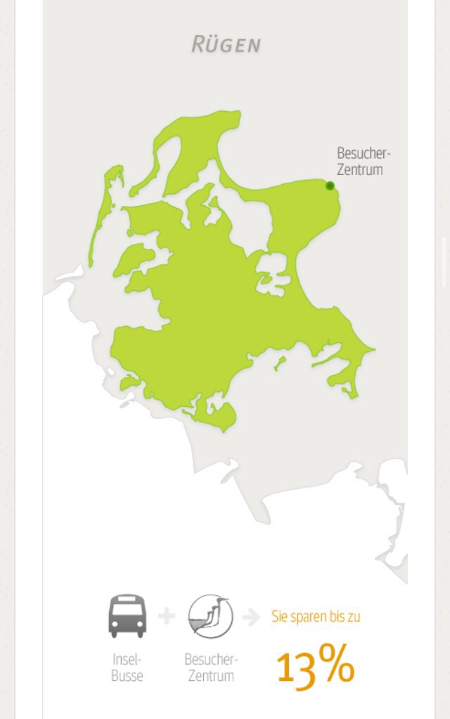
이것은 슈트랄준트까지 갈 수 있는
기차+뤼겐섬 버스+쾨니히 슈툴 콤비!
무려 61%저렴해집다!!!
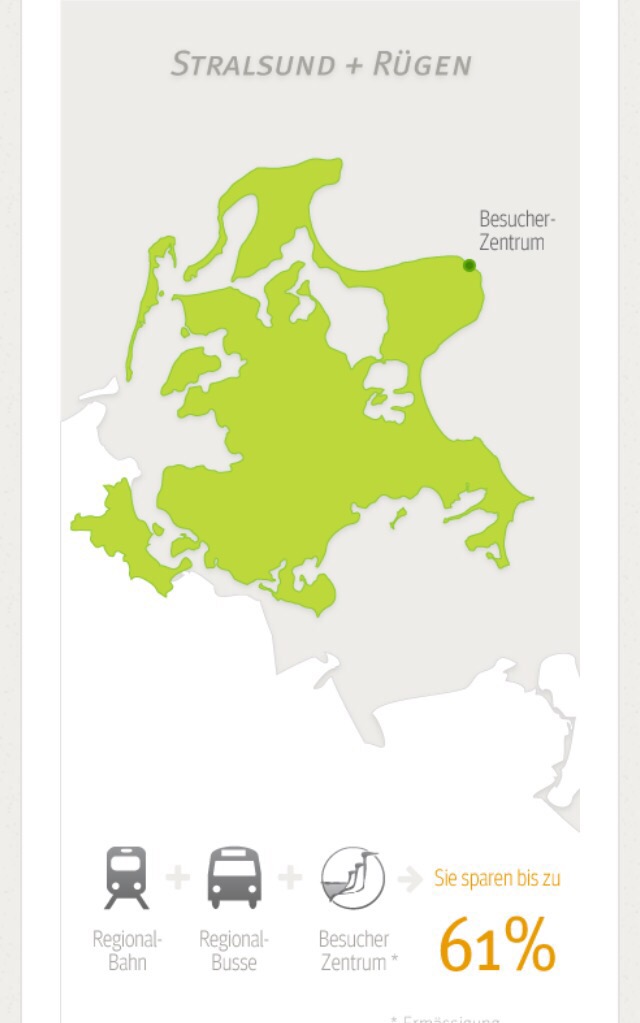
자세한 정보는
밑에 링크 클릭•.•
Zeiten und Tickets
Direkt am berühmten Kreidefelsen Königsstuhl bietet das Nationalpark-Zentrum KÖNIGSSTUHL ein ganz besonderes Naturerlebnis.
www.koenigsstuhl.com
이제 집에 돌아 가야하는데
가기전에 뤼겐섬
이곳 저곳을 둘러보기로!

이곳은 Sellin입니다!


저기 바다 건너 쾨니히 슈튤
흰절벽이 보여요 ㅋㅋㅋ


이제 다시 fischzeit!!
다시 생선 ㅋㅋㅋ
2인분 모든 생선구이!

많다! 좋아 ㅋㅋㅋㅋ
맛도 꿀맛>.<
진짜 집으로 돌아가야데 ㅠㅜㅠ
아쉽...
고속도로로 빠리려는 찰나!
Karl's Erdbeerhof!!
여기 들러서 군것질거리 사가자!!

아기자기
귀염귀염

수제사탕 만들고 계십니다!


사탕이랑 쨈이랑 그릇 사고
진짜 집으로!!
힘드니깐 집생각이 절로!!!

#뤼겐섬 #Rügen #여행 #독일여행 #독일자동차여행 #유럽자동차여행 #유럽여행 #유디니 #독일섬 #독일생활 #유디니독일 #sassnitz #sellin
[출처] [Rügen] 뤼겐섬 /독일북부/Sassniz/뤼겐 국립공원 /독일섬 /유럽자동차여행 /독일자동차여행/Königsstuhl/Kreideküste/뤼겐섬 꿀팁|작성자 꽃가비
이것도 작년 여행기록이에요!
여행을 안 다닌것 같은데..
나름 틈틈히 다녔더라고요ㅋㅋㅋ
작년 봄!
뤼겐섬을 다녀왔어요>.<
집을 떠나면 이렇게나 좋다
아침 일찍 일어나
출발해서 오빠가 피곤하다고
자다 가자고 ~
쉼터에 차를 세웠어요!
나는 안 졸리니깐 산책^^
날씨는 진짜 끝장!
파노라마 썬루프
밖은 추울때라
유리창 넘어 햇살을 느낄 수 있는
파노라마!
탁월한 선택이였어요 ㅋㅋ
심심하니깐 사진도 찍고><
뤼겐 가는 길에 노이브란덴부르크 라는
작은 도시에 들러보기로 했어요•.•
노이브란덴부르크~
작은 도시였어요~
지도로 봤을땐 컸는데..
해가 지기 전에!
슈트랄준트 Stralsund로
weiter fahren
이곳이
뤼겐섬으로 들어갈 수 있는
통로!!
슈트랄준트 입니다>.<
통로라고 했지만..
동네가 알록달록
딱 내 취향!
역시 바닷가는>.<
너무 좋다!
근데...저 저 길에서 핸드폰을
던져서..의도치 않게ㅠㅜ
액정이 .....
제 핸디는 고장이 나버렸어요 ㅠ
삐뚤어 질꺼야 징징징
오빠가 여행와서 계속 울쩍 할까봐
괜찮다고~토닥토닥
오빠 핸디로
연락 안 되서 걱정할까
엄마한테 연락해놓고
한시름...
일단 배고프니깐저녁 먹으러
저녁은 생선이지
맛 없으면 삐뚤어질꺼야!!!!
한마리씩 ㅋㅋㅋ
독일답게 감자랑•.•
바다보면서~
맛있어서 기분이 좀 나아지고^^
해 떨어지기 전에 숙소로!
숙소는 Sassniz에 잡았어요~
그 이유는 쾨니히슈툴 근처라!
이렇게 차로 다리를 건너면
뤼겐•.•
바로 숙소로~
숙소 너무 예쁘다!!!
우리 방에서 본 뷰
너무 예쁘다ㅠㅜ
나 내일 아침 일찍 일어나서
새벽 바다 볼래~~
그리고 사진에 없는 Putgarten!
독일 땅끝! 독일 최북부!
Arkona...
저의 저녁이 될때 갔는데..
밤바다보는게 무서운 나는...
이상한 공포증 ㅋㅋ
낭떨어지도 무섭고
그냥 바다만 보이는 곳이 무서워서
걍 다시내려옴 ㅋㅋㅋ
그래서 사진이 없어요!
그리고 자쓰니츠 바닷가로!
맥주 마시러ㅋㅋㅋ
아까 먹은건 생선밖에 없으니깐 !!
뜻밖의 선물
분홍 노을ㅠㅜ
미친다...
사진찍고 딱 10분 뒤
어둠이...
운이 좋았어!
바닷가 바로 앞에 있는 식당~
싀원한 맥주 시키고!
잔이 특이
안주는 생선이랑 새우
그리고 그 다음날
아침 눈뜨자마자 발콘으로!
해가 없다?
괜찮아
조식 먹고
쾨니히슈툴보러!!
차로 입구 까지 갈 수있는
길이 있더라고요>.<
좋아!
그런데 이상하다;;;
길이 막힘^^
이유는...성수기를 대비한
늙은 나무청소•.•
쫌 돌아서Parkplatz Hagen에
주차를 하고 국립공원을 가로질러
가기로
지도를 보니 한 30분만 걸으면
쾨니히슈튤을 볼 수 있다니
그래..가자 ㅋㅋㅋ
나투어파크ㅋㅋㅋ
그냥 나무가 무성한 길 ㅋㅋ
나뭇가지만 앙상^^
30분이래며~~~~~
!오르막길이 있음!
그래도 어찌어찌 도착!
근데 벌써부터 돌아가는길이
걱정이 된다
입장료를 내고!
입장료는 8.50€
학생할인 없음*.*
드뎌 입장>.<
사람은 많이 없어서 좋았어요^^
요런 그림이 있는데!
카스파르 다비드 프리드리히
Caspar David Friedrich가
약 1818년에 kreideküst를
그린 그림이에요!
실제로 얼마나 비슷할지 기대^^
높다 무섭다
이런 절벽...
물도 맑고ㅠㅜ
하얀 절벽도 너무 예뻤어요><
사진찍고
저 난간엔 Lebensgefahr표지판이
후덜덜
생명의 위험..
절벽 밑에 있는 바다를 보니..
너무 내려가고 싶은거에여!!
밑을 봤더니 사람들이 있더라고요•.•
어케 내려갔지??
아저씨한테 물어보니
계단이 있데요><
매표소를 나와서 보니
표지판이 보이더라고요
도전!
오늘 많이 걷는다;
몇 계단 안 내려가서 알게됬어요
큰일 났다ㅠㅜ
계단이 흔들려 ㅠㅜㅠ
무셔
많이 내려왔는데도...
바다는 계속 보이는데...
어쨋든 내려오는건 성공!
올라가는건 나중에 생각하자 ㅜ흑
ㅇㅖ쁘다!!!
이제 Keideküste구나!!
진짜 하얗다><
절벽이 분필이여
오빠랑 사진•.•
오빠 눈썹 왤케 내려갔어!!
올라가는 사진은 없어요...
나무다리가 부서질 것 같고
무섭고 힘들고;(
포스팅하면서 구글에
쾨니히슈튤 검색하니깐
바로 요게 나오네요 ㅋㅋ
TREFFE...
검색해보고 갈껄 ㅋㅋㅋ
쉽게 봤어...
다리 후덜덜하게 올라와서
또 나투어 파크를 지나
차가 있는 주차장으로..
진짜 힘들었어요 ㅋㅋㅋ
홈페이지에 들어가면!
주차장에서 버스이용해서
쾨니히 슈튤 가는 표
16%를 절약할 수 있고
뤼겐섬 버스+쾨니히슈튤 콤비는
13%를 저렴하게 이용할 수 있데요!
뤼겐섬 안에서 버스로 이동하 실
분들은 이 티켓 추천!
이것은 슈트랄준트까지 갈 수 있는
기차+뤼겐섬 버스+쾨니히 슈툴 콤비!
무려 61%저렴해집다!!!
자세한 정보는
밑에 링크 클릭•.•
Zeiten und Tickets
Direkt am berühmten Kreidefelsen Königsstuhl bietet das Nationalpark-Zentrum KÖNIGSSTUHL ein ganz besonderes Naturerlebnis.
www.koenigsstuhl.com
이제 집에 돌아 가야하는데
가기전에 뤼겐섬
이곳 저곳을 둘러보기로!
이곳은 Sellin입니다!
저기 바다 건너 쾨니히 슈튤
흰절벽이 보여요 ㅋㅋㅋ
이제 다시 fischzeit!!
다시 생선 ㅋㅋㅋ
2인분 모든 생선구이!
많다! 좋아 ㅋㅋㅋㅋ
맛도 꿀맛>.<
진짜 집으로 돌아가야데 ㅠㅜㅠ
아쉽...
고속도로로 빠리려는 찰나!
Karl's Erdbeerhof!!
여기 들러서 군것질거리 사가자!!
아기자기
귀염귀염
수제사탕 만들고 계십니다!
사탕이랑 쨈이랑 그릇 사고
진짜 집으로!!
힘드니깐 집생각이 절로!!!
#뤼겐섬 #Rügen #여행 #독일여행 #독일자동차여행 #유럽자동차여행 #유럽여행 #유디니 #독일섬 #독일생활 #유디니독일 #sassnitz #sellin
[출처] [Rügen] 뤼겐섬 /독일북부/Sassniz/뤼겐 국립공원 /독일섬 /유럽자동차여행 /독일자동차여행/Königsstuhl/Kreideküste/뤼겐섬 꿀팁|작성자 꽃가비
View
(
0) liked
(
0) commented
After you login, you can see the comments and like the post. Login